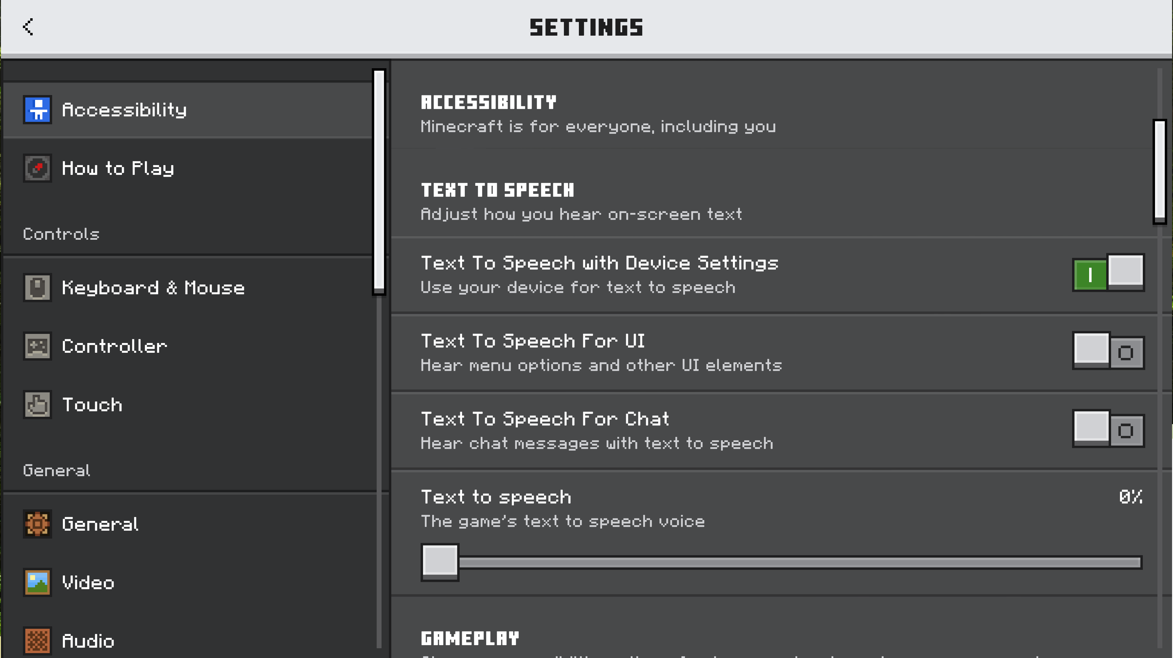
We welcome feedback about menus, toggles on menus, buttons on menus, input devices (like touch controls and keyboards), and Minecraft’s interface. How do you play? What would make it better?

1406

Let’s talk about our updated settings! (Bedrock)

Pinned

952 Comments

Please sign in to leave a comment.

Sorted by oldest
  • 2
    Registered User commented
    Comment actions Permalink

    I personally don't think it needed a separate menu. It just feels off? Feels a bit slower than the old ui as well. But nice green.

  • 5
    Registered User commented
    Comment actions Permalink

    I have an ultra wide monitor and this design DOES NOT make use of the space properly. The sliders are stupidly long and there is wasted space either side of them. On larger displays, a two column layout would look so much better than having loads of extra space due to limiting the maximum width of the sliders and still having the maximum width look silly.

  • 0
    Registered User commented
    Comment actions Permalink

    Інтерфейс дуже класний дякую.
    І пропоную вам додати нового моба random мирний чи ворожий неважливо.
    І структуру в якій і буде знаходитись цей моб.

  • 0
    Registered User commented
    Comment actions Permalink

    👍

  • 0
    Registered User commented
    Comment actions Permalink

    MINECRAFT POR FAVOR TRAGA A VACA AMARELA

  • 1
    Registered User commented
    Comment actions Permalink

    Subtitles for the music play in game for example Sweden and living mice


  • 1
    Registered User commented
    Comment actions Permalink

    This is much BETTER! I love this new audio setting!
    More clean, Better UI!

  • 2
    Registered User commented
    Comment actions Permalink

    Please consider adding a toggle for a fixed centered width, not merely the screen safe area option.
    In fact, this very website's body has a fixed centered width!

  • 2
    Registered User commented
    Comment actions Permalink

    It feels kinda disconnected with other part of the Settings. My first impression was "why do I need to be send here?"
    The usual setting feels more integrated, like, I can get what I want from that single place. The lost of convenience feature is highlighted in mobile version where u used to be able to use left thumb to navigate and right one to do the setting. Rather than throwing us somewhere else midway during tweaking the setting, why not adding more category like redstone contraptions noise setting.

  • 1
    Registered User commented
    Comment actions Permalink

    can you put the ambient music from C418

  • 1
    Registered User commented
    Comment actions Permalink

    hi!! can you add music customization to minecraft, i want to repeat the og music, also the music is not loud enough, even though i set my volume to the max, i hope you'll fix it, thanks!

  • 2
    Registered User commented
    Comment actions Permalink

    Looks great, but its annoying how it opens a full menu, while as previous it was a quick little scroll and a swipe


  • 0
    Registered User commented
    Comment actions Permalink

    Smpi spider

  • 0
    Registered User commented
    Comment actions Permalink

    Please give me a high graphics in Minecraft i want a high graphics please

  • 1
    Registered User commented
    Comment actions Permalink

    I think the new Ore UI thing for settings menu is good as of the other UIs. But the audio part takes to a different page which I think is a bit odd. It should be at side of the left menu like before. And other right parts of other settings (e.g. Video, General, Account etc.). And there shouldn't be any gaps in between options. Else that everything is fine!

  • 0
    Registered User commented
    Comment actions Permalink

    Es muy buena pero los controles estás un poco trabados y algunos tirones que me daba pero de eso está bien

  • 1
    Registered User commented
    Comment actions Permalink

    Please add an option to turn off cave sounds separately from other ambiences!

  • 2
    Registered User commented
    Comment actions Permalink

    The new language settings are good but the right side it's extremely empty, why don't to put another languages side there and not just vertical options?????????????????? It's also for accesibility, beacuse the user will find it's idiome easier and quickler.

  • 0
    Registered User commented
    Comment actions Permalink

    Hiya dad

  • 0
    Registered User commented
    Comment actions Permalink

    Que por favor puedas poner muebles crafteables el crafteo como se te de la gana 


  • 2
    Registered User commented
    Comment actions Permalink

    Everything is horrible! The new interface in Minecraft PE Beta is preventing me from using 90% of my addons, NOBODY asked for an interface update, we just want more performance in the game, something you leave to be desired in Vibrant Visuals!

  • 1
    Registered User commented
    Comment actions Permalink

    I hope you add Arabic as your favorite.

  • 0
    Registered User commented
    Comment actions Permalink

    I don't know if this is a bug or by design but there is no "Toggle Crouch" option on PC keyboard and mouse. It hurts my finger in the deep dark biome

  • 2
    Registered User commented
    Comment actions Permalink

    It looks pretty good, but does it have to be in a separate menu? Also, I hope support to modify ore ui with resource packs is an option at some point, as it being hardcoded makes that currently impossible. It would be nice to be able to change the looks to personalize it. 

  • 0
    Registered User commented
    Comment actions Permalink

    It's good but my Minecraft when I try to put a mod from the marketplace it says there was an error loading your package

  • 0
    Registered User commented
    Comment actions Permalink

    Hiii world beat games

  • 2
    Registered User commented
    Comment actions Permalink

    I really miss the left sidebar, and it looks reaally empty in the middle, like the bars are too long.

    I do like the effort of standardizing the design shown when creating a new world because I love that, and the team should look forward to make the rest of the settings transition from the gray looking buttons to the green ones that look a lot better.

  • 0
    Registered User commented
    Comment actions Permalink

    อยากให้มีภาษาไทย

  • 0
    Registered User commented
    Comment actions Permalink

    Please

  • 0
    Registered User commented
    Comment actions Permalink

    Bro I LOVEE the new ore ui keep it up