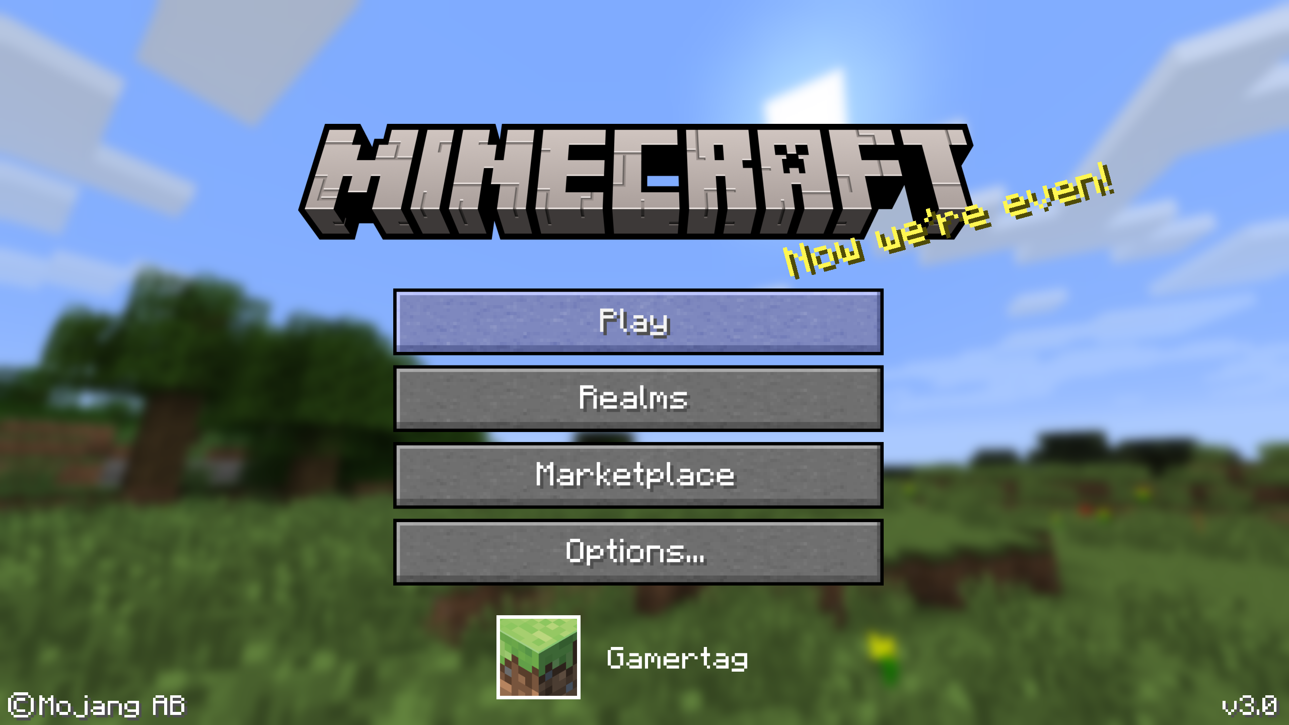
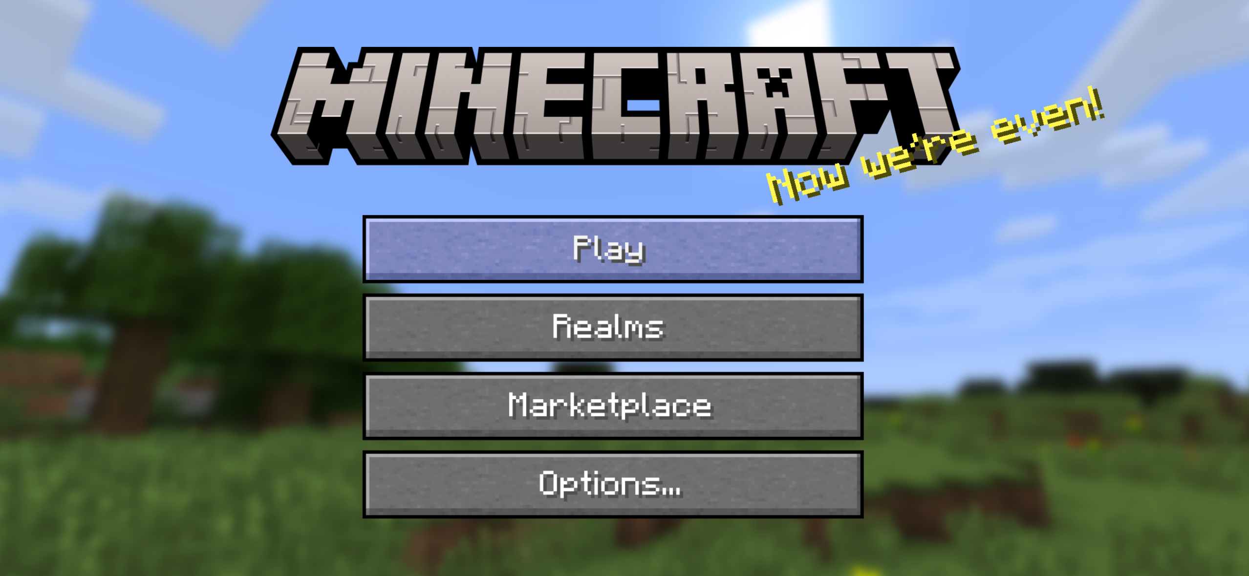
Do you guys think bedrock edition should have Java aesthetics. For start the title menu, looks very Minecraft IF, swapping flat buttons with Java stone button texture and dirt boarder, rather than flat color buttons just looks kinda soul-less and has no character that was once had before.
Compact layout actually improves mobile ergonomics compared to the current sprawling menus.
I think it’s best so if new Minecraft players wants to play on mobile or console when they can’t afford a pc to play Java, this prevents players to complain something they didn’t expect to have when they can’t afford Java version.
Here is the concept art I had fun making. What do you think? (NOT GENERATED BY A.I) ((I used Clip Studio Paint))
Clean Main Title (Panoramas has nothing to do with the feedback)
Options Menu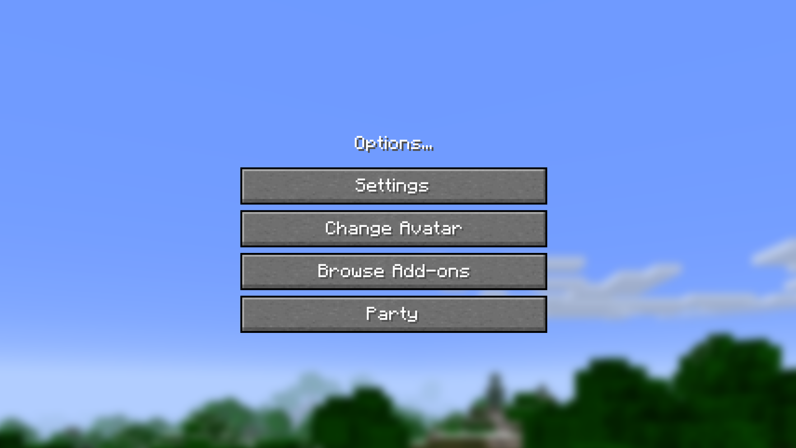
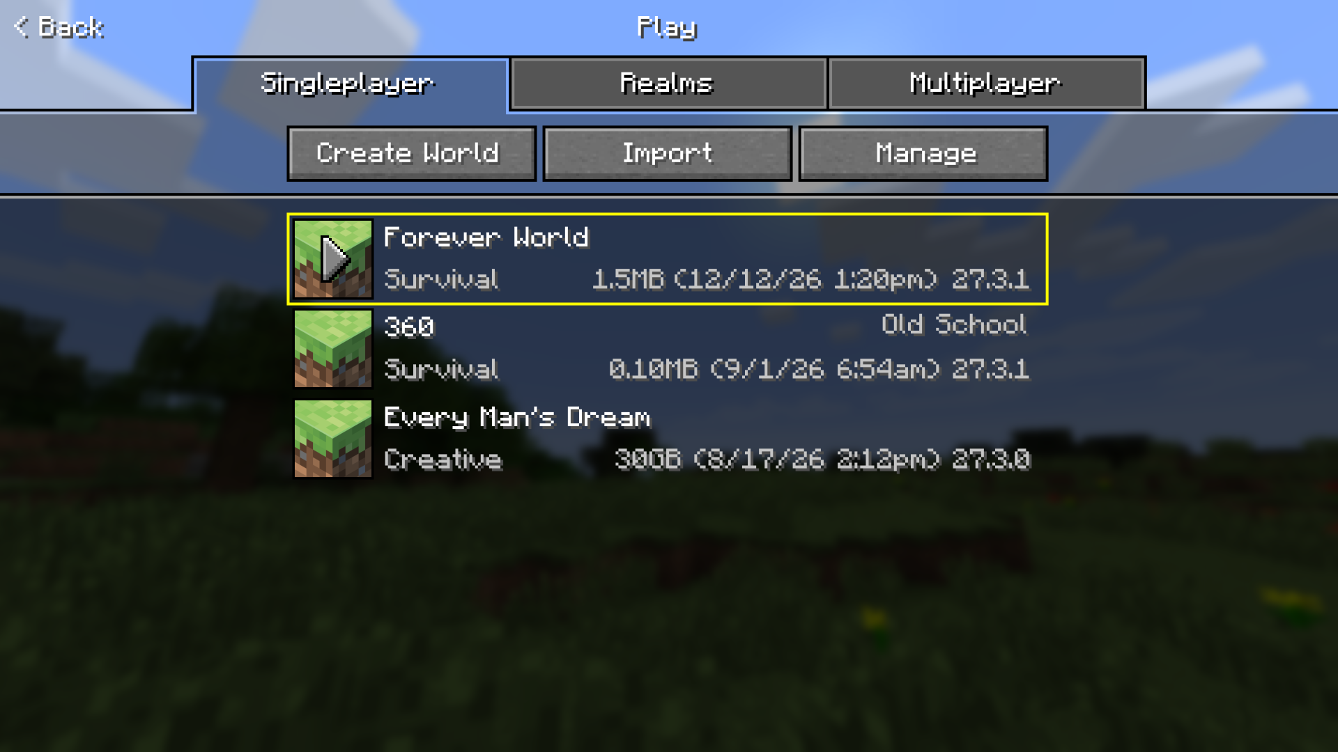
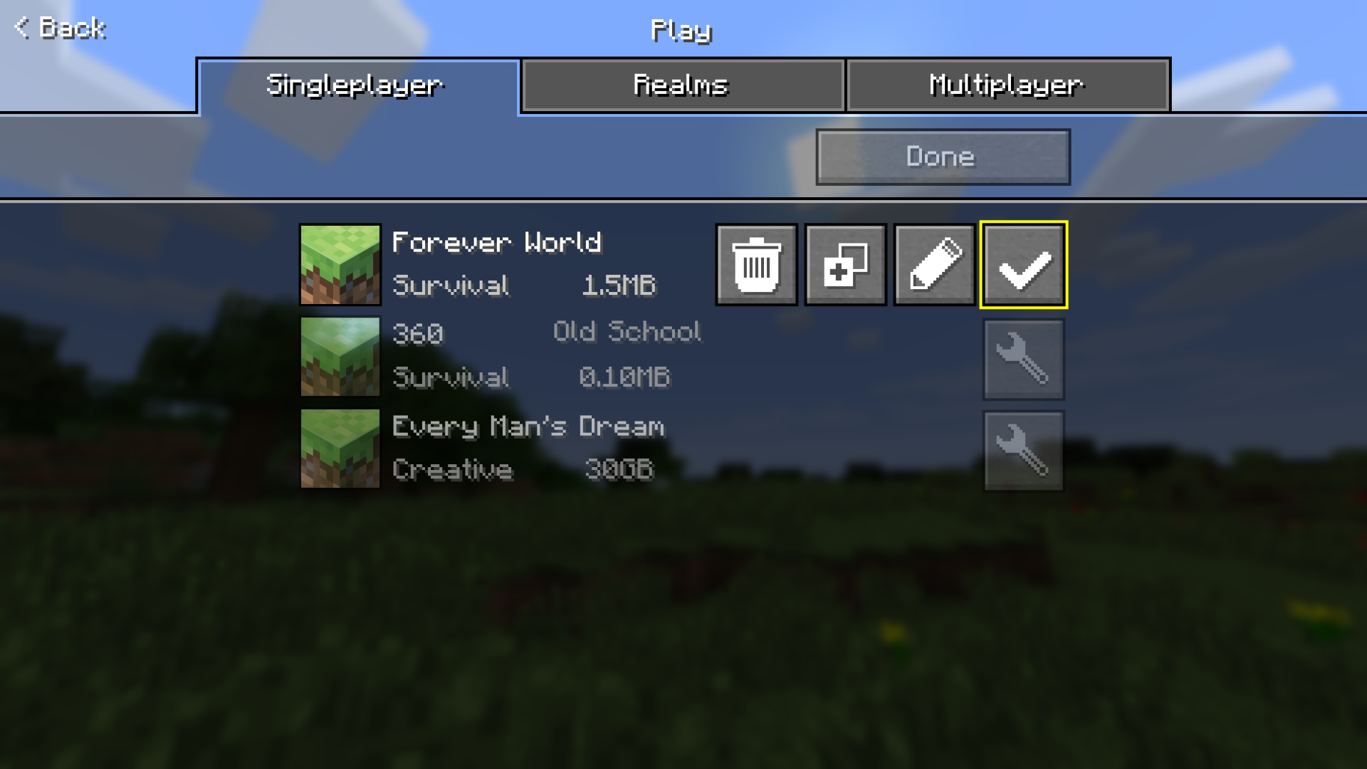
Game Menu
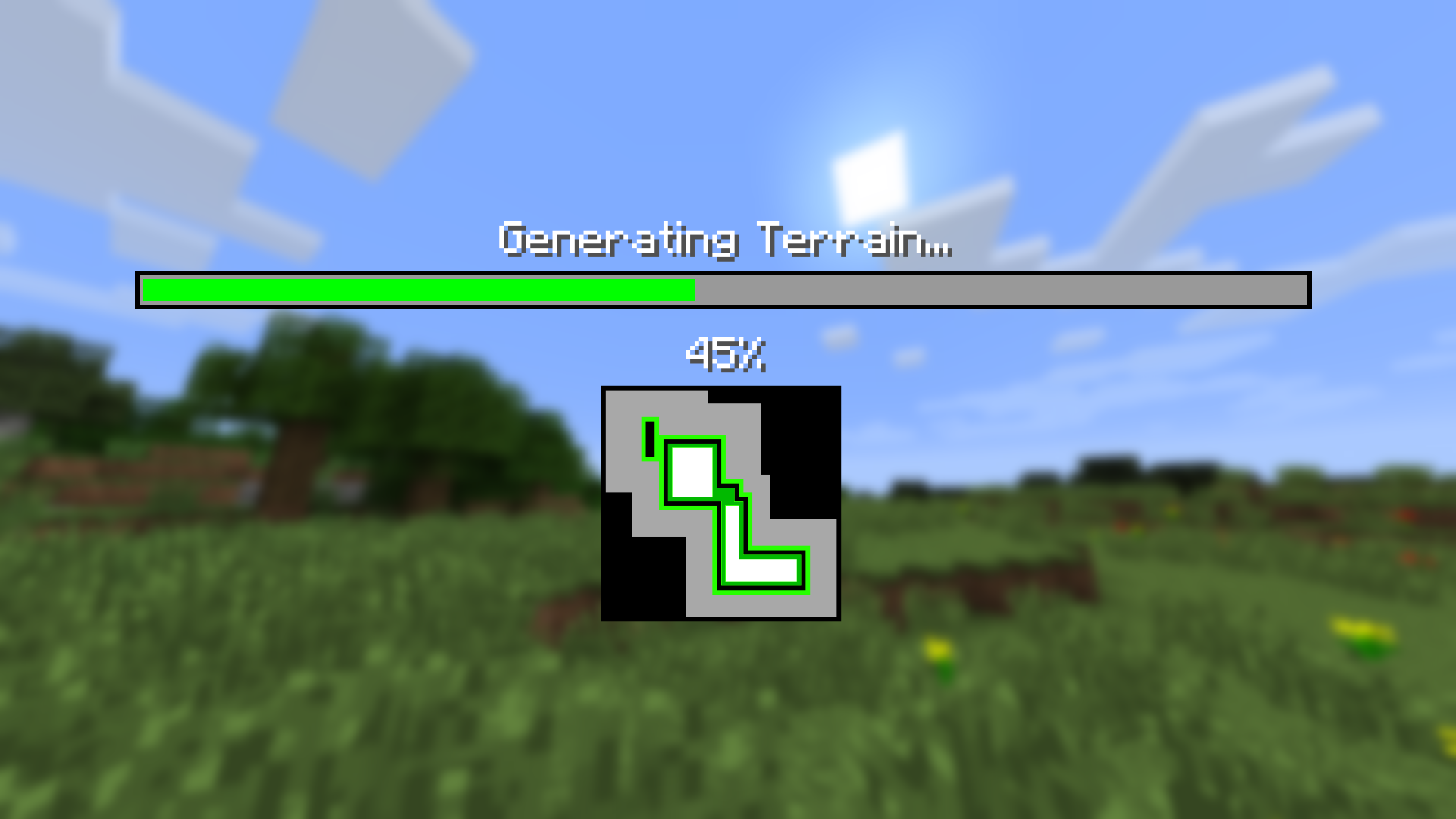
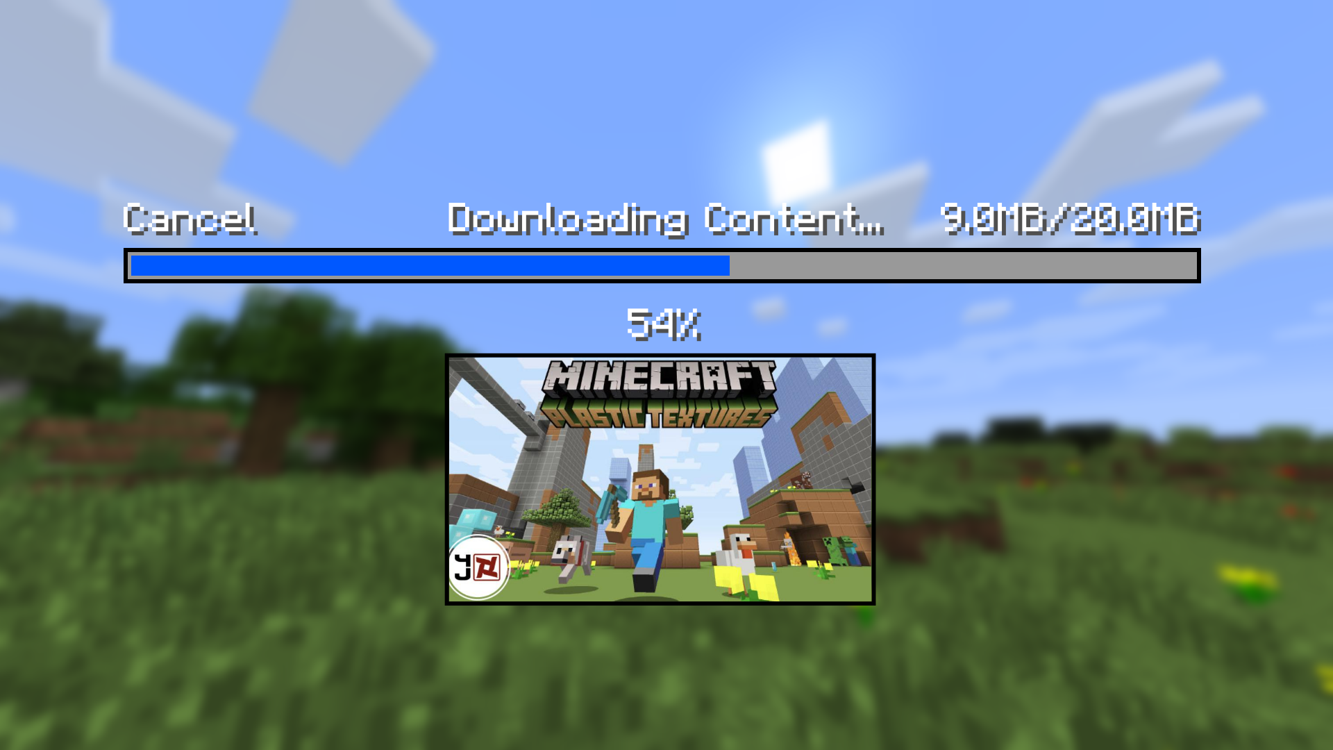
Proper loading screens
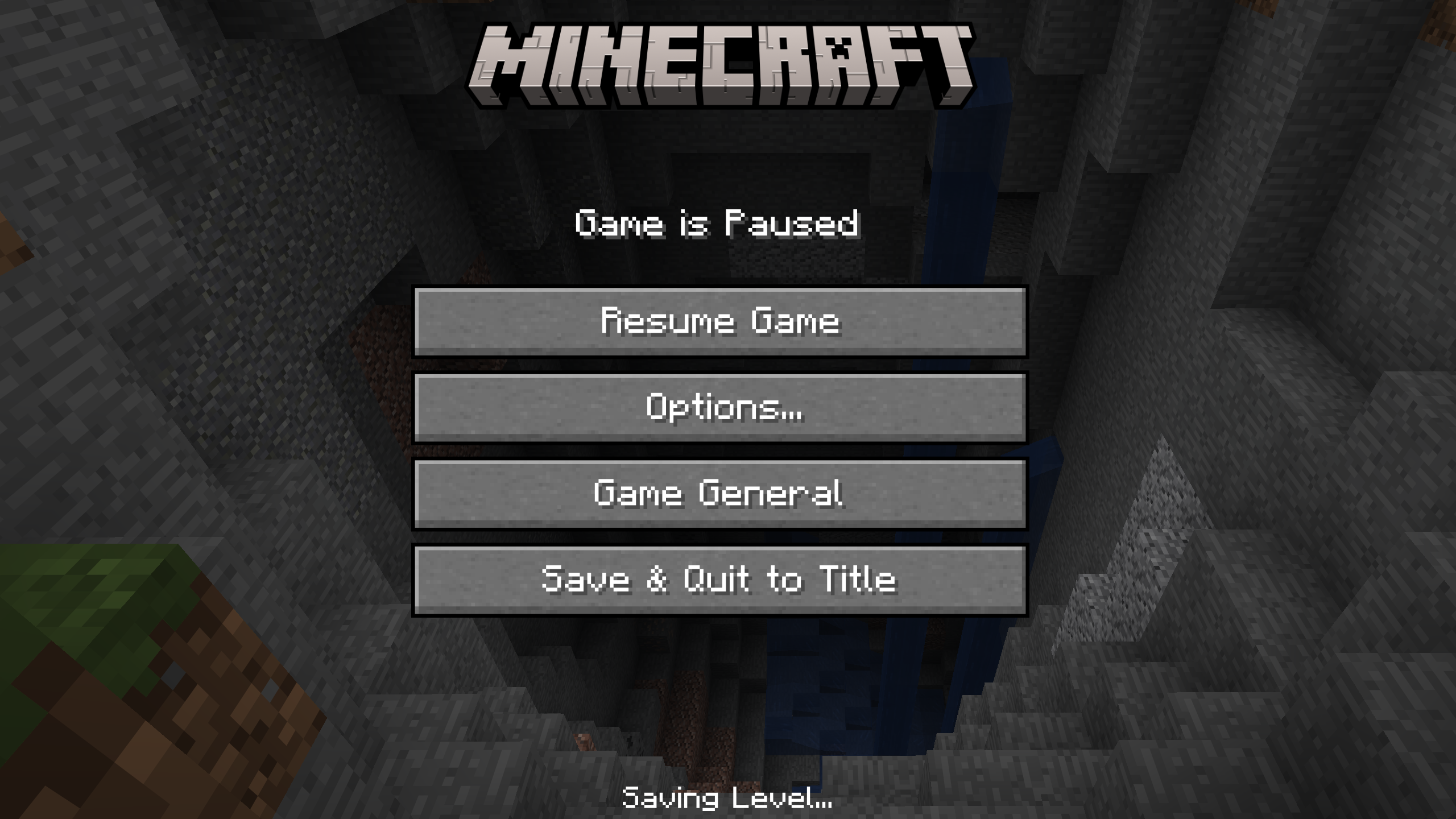
(CLEAN) Pause Menu with no annoying doll that was on the right.
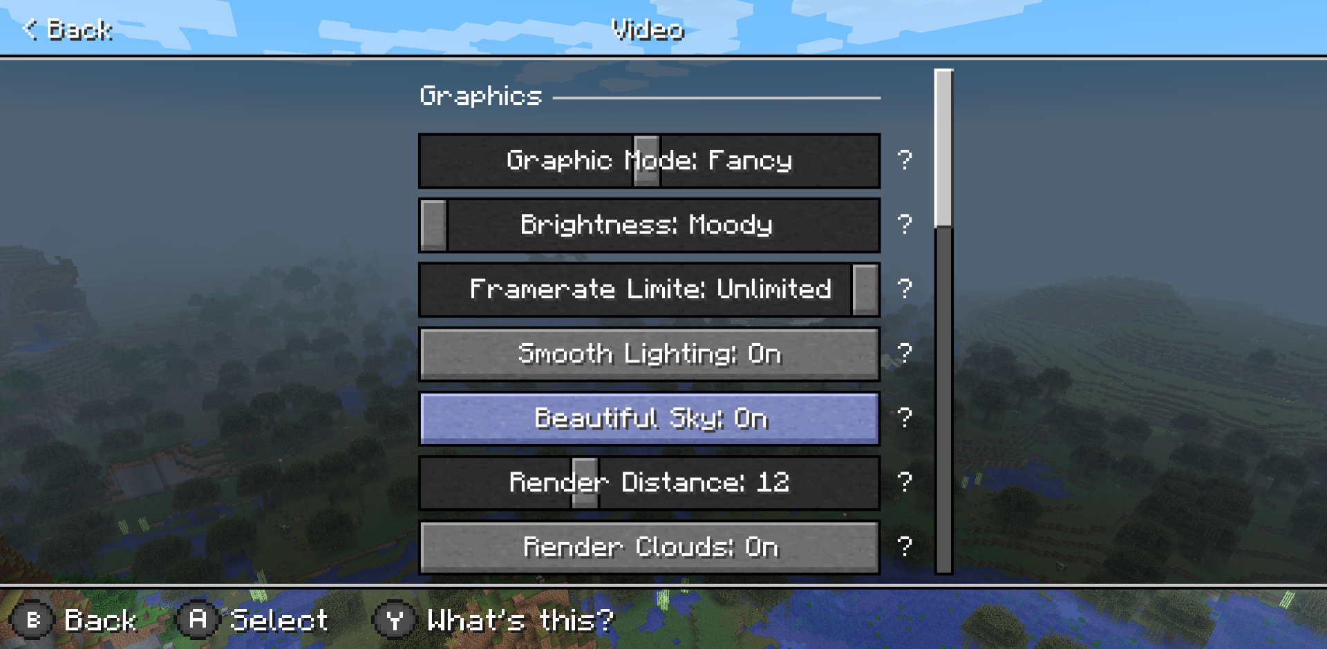
Video Settings
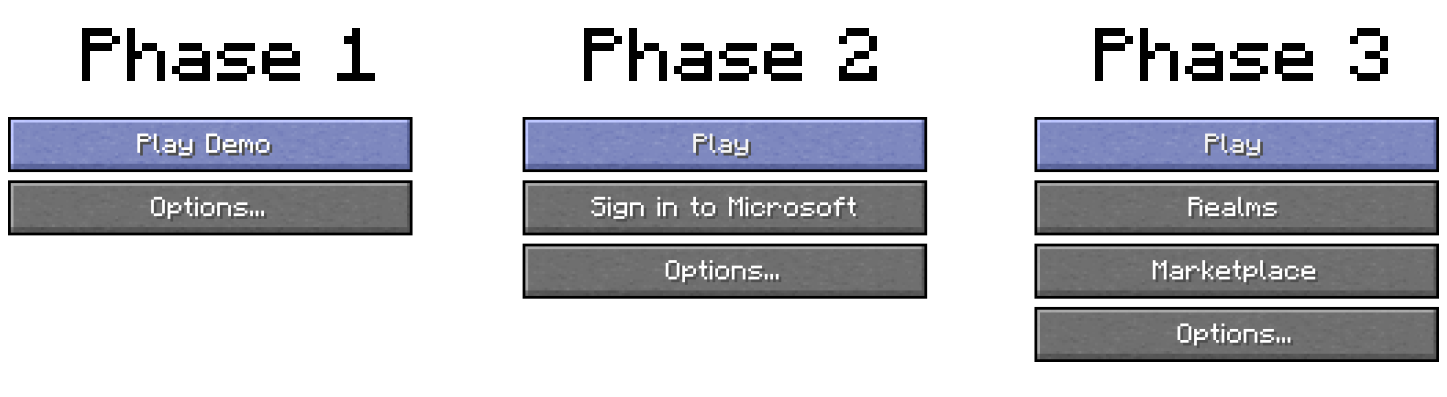
Title Menu phases
— Mobile Ratio —
That's my final mockups.
I hope you understood my idea, and I hope my idea works great to perform the game smoothly and welcomely.
Please sign in to leave a comment.
4 Comments