Ore UI should NOT be removed, no matter what other people say about it. Instead it should have a toggle between Clean Layout (the existing layout) and Compact Layout, which is where the options are closer together like Json UI, and to get the descriptions u have to hover over the option. Ore UI probably looks the way it does because it is optimized for mobile players.
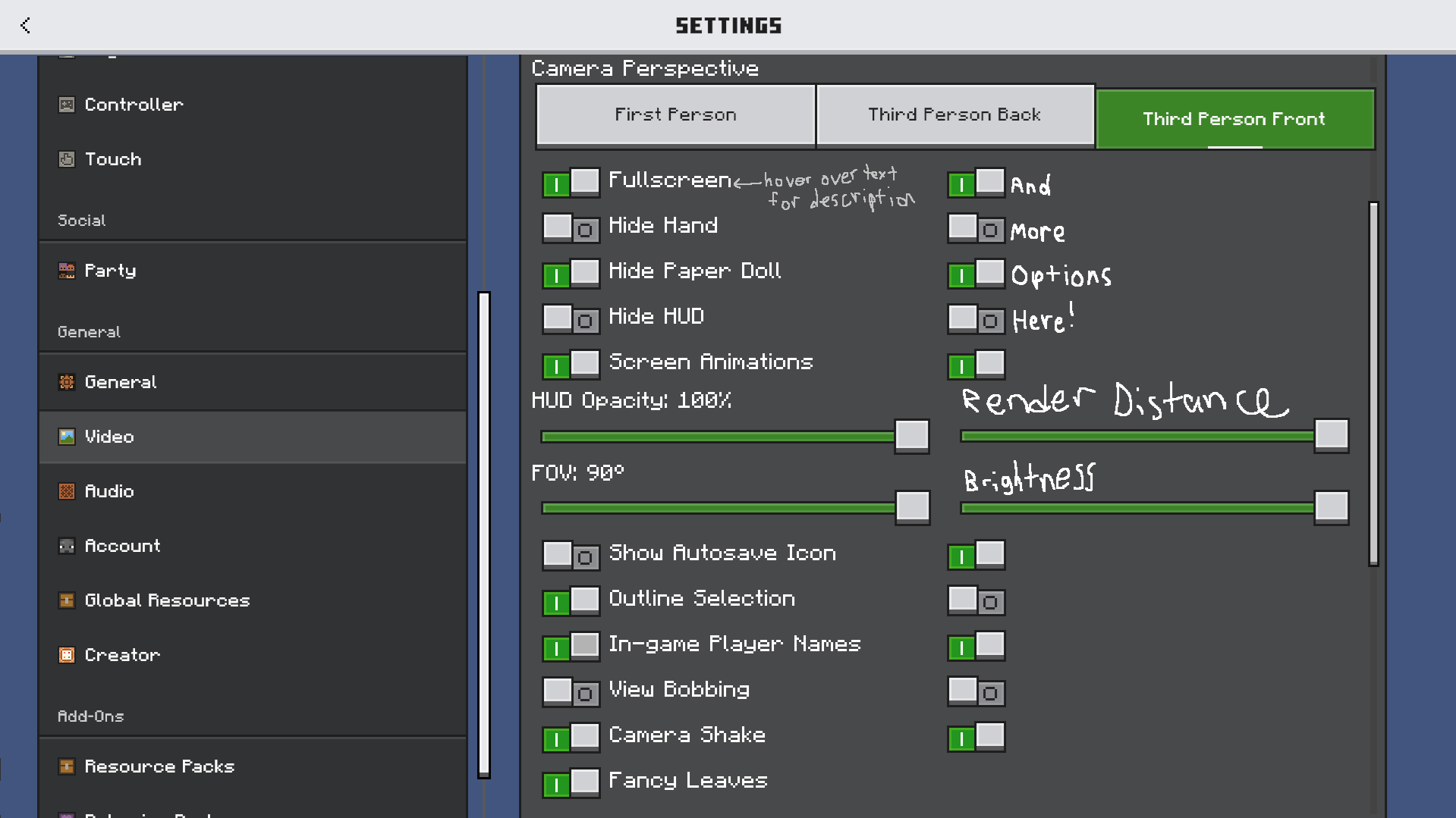
I propose an idea for a new design Mojang could use in the Compact Layout mode, which I made by combining the Json UI accessibility with Ore UI styled looks in MS Paint. This menu design shows what mobile Minecraft is holding Mojang back from doing.
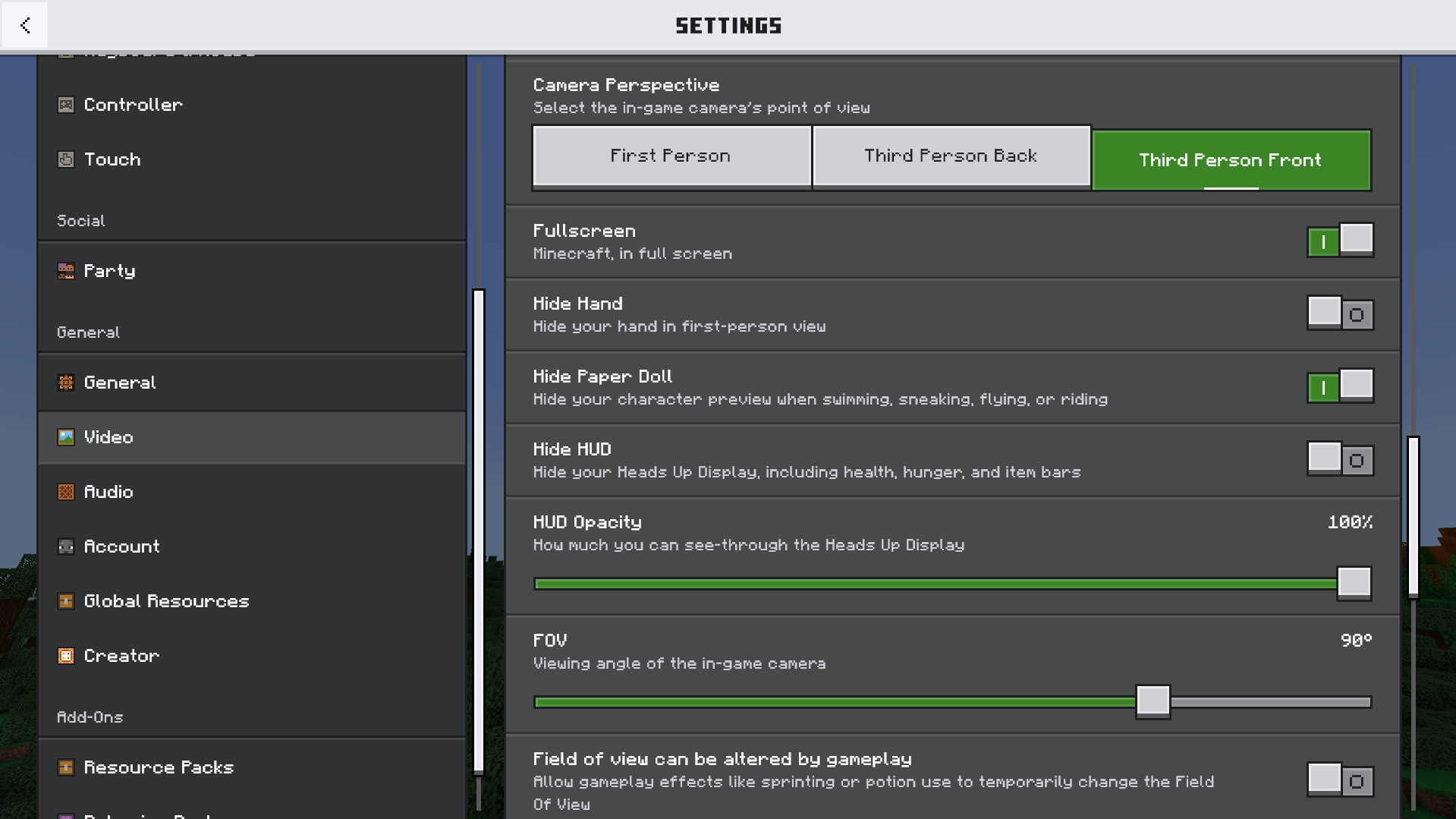
Now here is the unedited screenshot. This UI is very accessible for mobile players, but the design I showed above shows what could be done for PC players. I know Bedrock is the main version of Minecraft, so this is what would lure the community into it.
Please sign in to leave a comment.
0 Comments