We welcome feedback about menus, toggles on menus, buttons on menus, input devices (like touch controls and keyboards), and Minecraft’s interface. How do you play? What would make it better?

105

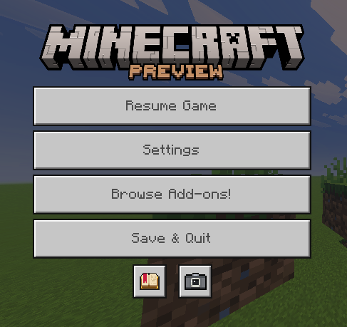
Let's talk about the updated game menu! (Bedrock)

Pinned

176 Comments

Please sign in to leave a comment.
Sorted by oldest
  • 7
    Registered User commented
    Comment actions Permalink

    It's awful.

    1. Nobody wants to "Browse addons" in the pause menu. No one. No human being wants this. Only greedy execs want this.

    2. New players are not gonna have a fun time trying to find settings. Make settings a big button again.

  • 7
    Registered User commented
    Comment actions Permalink

    This change is yet another example of how Java Edition will always be the primary version of Minecraft and how Bedrock Edition is a severely lacking edition that Microsoft only prioritizes as a cash-grab rather than a truly good experience for users.

  • 0
    Registered User commented
    Comment actions Permalink

    That's menu is cool and I love this update

  • 5
    Registered User commented
    Comment actions Permalink

    The settings button is more commonly used than the marketplace button, and so they should swap places.

  • 4
    Registered User commented
    Comment actions Permalink

    The settings button being moved and replaced with the market button front and center is horrible. This is first and foremost a children's game, it ridiculous that there is no way to move this or adjust it, or outright disable it. Beyond greed, this just feels like an attempt to get accidental purchases. The change was not needed, as if anyone who wants to purchase a skin or a pack doesn't already know where to go. I already bought this game, like 15 times at this point for all the members of my household plus me, please stop trying to shove microtransactions in our faces every time we try to adjust the settings or even just bring up the menu. 


    Beyond that it just makes the menu awkward and makes accidental quitting when going into the settings way too easy to happen.

  • 5
    Registered User commented
    Comment actions Permalink

    Please remove the disgusting "Browse add-ons!" from the middle of the main menu. Please bring back the big "Settings" button. This is a terrible change.

  • 2
    Registered User commented
    Comment actions Permalink

    I like how: 1. Mojang made this post about a UI design. 2. The community widely expresses only negativity in the comments for it. 3. Mojang implements it exactly as-is.

  • 4
    Registered User commented
    Comment actions Permalink

    This is absolutely horrible - hijacking players' muscle memory to get them to click into your microtransaction money pit. You should feel ashamed for this change.

  • 5
    Registered User commented
    Comment actions Permalink

    Bro why Microsoft got to be so greedy and money hungry and wanting to exploit the younger generation with the changes for the location of the pause menu buttons. Just revert it at this point and destroy the marketplace buttons except from the home screen when not in a world or making a world.

  • 3
    Registered User commented
    Comment actions Permalink

    there was NOTHING WRONG with the old ui, if its not broken why fix it? it wasnt broken to begin with and now you go and break it

  • 4
    Registered User commented
    Comment actions Permalink

    the comments having more upvotes than the original post just shows that theres something wrong. this is the most retarded update maybe in the history of this game

  • 1
    Registered User commented
    Comment actions Permalink

    The menu should still have a background other than the view of the game, or it should just be the same style and layout as the Java edition menu.

  • 3
    Registered User commented
    Comment actions Permalink

    Why in gods name is browse addons the second option with settings now being hidden under a smaller icon? Change it back, no one cares about addons. We know you want people to accidentally buy stuff. Microsoft is a loser company that ruins anything they touch.

  • 3
    Registered User commented
    Comment actions Permalink

    The settings button and the marketplace button needs to be swapped.

  • 1
    Registered User commented
    Comment actions Permalink

    I lost almost ALL my worlds to this update. The "browse addons" ui is so useless, switch out the marketplace ui with the settings one.

  • 1
    Registered User commented
    Comment actions Permalink

    swap the market place and settings button and the social menu is unnecessary because it takes so long to load when i just wanna change perms for my friends without having to wait around 2 minutes.

  • 1
    Registered User commented
    Comment actions Permalink

    Also, why the heck do you have to click a stupid a social tab button just to see who is on your world!

  • 1
    Registered User commented
    Comment actions Permalink

    Words cannot describe my disappointment for how things panned out this past 10+ years of playing the game. Actively watching the all the feedback turntables.
    "We’d love to hear your thoughts on this! Let us know in the comments — what do you think?" 
    Is not the level of transparency we are getting at this point. This is another fortnite rust case. 

  • 0
    Registered User commented
    Comment actions Permalink

    The "Browse Addons!" button become one of the small buttons along with achievements and camera.

  • 0
    Registered User commented
    Comment actions Permalink

    Regarding the new sulfur blasts, it will be better if you add a sound when they blast, because when I saw it blast without any sound, IT SO PLAIN but I know its beta so I hope it gets sound effect. Thank you for reading.

  • 0
    Registered User commented
    Comment actions Permalink

    2005

  • 0
    Registered User commented
    Comment actions Permalink

    2005

  • 0
    Registered User commented
    Comment actions Permalink

    2005

  • 0
    Registered User commented
    Comment actions Permalink

    If scoreboard displayed in the "list", I should you add it to the social menu. Or some servers affected.

    https://feedback.minecraft.net/hc/en-us/community/posts/40805261991565-A-scoreboard-should-be-added-to-the-new-pause-screen 

  • 1
    Registered User commented
    Comment actions Permalink

    I would also like to add a button under the world section, just like older versions, FOR THE SAKE OF GOD PLEASE ADD THE IMPORT AND EXPORT WORLDS! MOJANG LISTEN TO ME

  • 1
    Registered User commented
    Comment actions Permalink

    I would also like to add a button under the world section, just like older versions, FOR THE SAKE OF GOD PLEASE ADD THE IMPORT AND EXPORT WORLDS! MOJANG LISTEN TO ME