Sign in
Skip to main content

Discuss Minecraft's user interface, menus, settings, and input methods. Share feedback on navigation, controls, accessibility, customization, and other features that affect how players interact with the game.

160

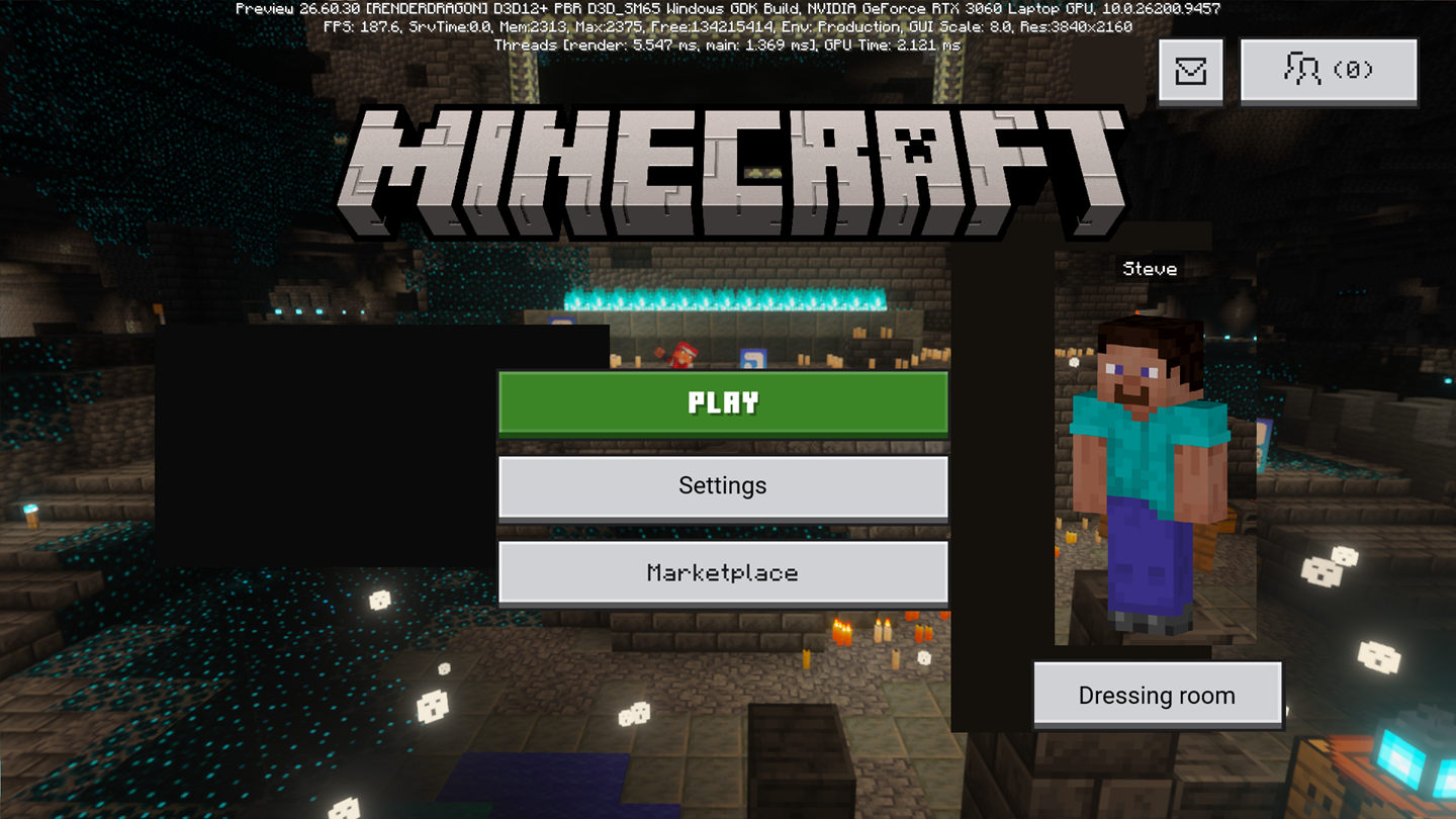
Let's talk about updated main menu (Bedrock)

Pinned

190 Comments

Post a new comment:

Please sign in to leave a comment.

Sorted by oldest
  • 7
    Registered User commented
    Comment actions Permalink

    Please stop trying to shrink and tuck away the settings button, it is the second most important button, right after the play button.

    Also, removing the title does not look good.

  • 5
    Registered User commented
    Comment actions Permalink

    I really don't know why Mojang is doing something like this again after the backlash they faced before, but what I do know is this new main menu doesn't look good at all. As most people have already pointed out the settings button not being one of the main buttons makes it really easy to miss and not to mention the fact the two of the main buttons are monetization related which, given the recent trends of large companies pushing stuff like this more and more, doesn't fill me with confidence. I'm also really confused as to why they removed the Minecraft logo from the menu when that gives it so much character especially since that's how every game menu has been for years not just Minecraft. Overall this new minimalistic design, that seems to promote monetization over being user friendly, just isn't a good and looks terrible especially compared to the old menu.

  • 4
    Registered User commented
    Comment actions Permalink

    With the lack of logo, I thought I was playing Craftsman! So in my panic, I accidentally uninstalled Minecraft and downloaded Vintage Story. Oops!

  • 3
    Registered User commented
    Comment actions Permalink

    I'm just going to be honest I am not a huge fan of the UI redesign for Minecraft Bedrock

    - First off the iconic Minecraft Title is no longer Present which in return makes the Title screen Uncanny to me.

    - the lack of Profile Icon and a more clear Setting and Notifications Icon and the proportions of Menu being very different from the Player Miniature in the Title Screen makes it feel very Bland and Disproportionate

    - Speaking of the Settings Icon its very Small and its very Tucked Away In the top Right Conner making it easy to Miss. when i saw the UI Redesign at first i thought the Settings was not even on the Title Screen. the Settings to me should be Right Below the Play button Icon Where it Was Before 

    I am Very Disappointed in the UI Redesign its Just simply Not Minecraft nor is it User-Friendly At All 

  • 5
    Registered User commented
    Comment actions Permalink

    You want to tell me an actual designer looked at this and thought it looks good?

  • 3
    Registered User commented
    Comment actions Permalink

    this is just for ads

  • 3
    Registered User commented
    Comment actions Permalink

    • The Minecraft logo disappearing is a confusing choice. Why would the menu need minimalism so greatly that the very name of the game is disposable? A clean menu is fine, but this is missing something for a main menu, (just in general, even ignoring the missing title). Even the pause menu has the name. Weird. I actually prefer the scaling of the pause menu, if that's helpful to designing the Main Menu.
    •The character being so large is unnerving, but also doesn't scale well with the rest of the menu.
    • The layout and size of buttons should probably be customizable at this point, since you seem to want fewer and to the side, and I could get used to it being to the side, but people don't want that it seems. Or you enough people dislike it that you didn't need to change it at all, but idk.
    • My PS5 preview isn't showing the Marketplace button at all, but people are showing it's placement to be a main one in preference to the settings button, and that doesn't seem necessary, considering people are reading it as a desire to push marketplace on players.

    •Why did dressing room need to move? Wasn't it fine under the character? Looked good and it's only function is related to it.

    •Generally, this menu doesn't say "clean" as much as "Why did they feel the need for change, and how did this feel finished enough to ship?"

  • 4
    Registered User commented
    Comment actions Permalink

    Why do they always feel the need to make existing things worse? The settings is a very useful button, so making it smaller and more difficult to get to is annoying and makes us in turn hate the marketplace more

  • 5
    Registered User commented
    Comment actions Permalink

    DO NOT put the content scrolling feed in Minecraft like we see in Roblox, Fortnite, Xbox Home, etc. Discovered this when watching PhoenixSC's latest video.
    If we WANT to buy something, we will go to the store
    If we WANT to look at news, we will click the mail button or look at official forums and videos.
    If we WANT to join online servers or Realms, we will click on the Multiplayer button.
    The only thing this new feed feature does is force these things in our faces. Its what made Roblox and Fortnite start to become overwhelming and start recommending slop and other experiences that don't properly match our (or at least my) preferences.

  • 2
    Registered User commented
    Comment actions Permalink

    I feel like the main menu buttons should go as follows: Play (For singleplayer worlds, join friends worlds, LAN worlds)
    Multiplayer (for creating and joining Realms, Featured servers and adding/playing servers)
    Settings. Absolutely important, especially when first downloading the game as for me I need to adjust the FOV, disable autojump, adjust sensitivity, possibly adjust quality, possibly change UI to classic all before playing on a new device.
    Marketplace could be above the settings button, and dressing room should stay under the skin.

  • 4
    Registered User commented
    Comment actions Permalink

    Why attempt to "fix" what no one from the playerbase has ever frequently considered to be flawed or broken in the first place?

    Focus on developing content instead, and abandon this pointless pursuit in its entirety immediately.

  • 2
    Registered User commented
    Comment actions Permalink

    The old one feels better because it more easy for settings and you can see if your in beta/preview or normal Minecraft and too much space leftover and no slash text? That's iconic so please change it or use the old one

  • 4
    Registered User commented
    Comment actions Permalink

    Terrible UI.

  • 2
    Registered User commented
    Comment actions Permalink

    I just hate it. But for those who live it, it could be an optional thing in the settings. PLEESE DONT MAKE THIS REAL. I WANT TO REALM

  • 2
    Registered User commented
    Comment actions Permalink

    Is there a single good comment here. Haven't found one, and I hope there is none, because that is literally getting every checkmark on the list of things a menu shouldn't do. Please Mojang, listen to the community. You should have learned from the last time you tried to hide the settings

  • 2
    Registered User commented
    Comment actions Permalink

    this is just horriable like i think you can see what you should do by looking at the comments i would suggest to like do it like the old main menu but like in ore ui something like that and why are 2 of the main buttons buying stuff??????????? do not let this to the main game pls

  • 4
    Registered User commented
    Comment actions Permalink

    The main annoyances I have is that the main buttons are off-center, there is no Minecraft title, the skin is too big, the settings button is too small, and the Dressing room button is not under the skin. Here's what it should look like:


  • 3
    Registered User commented
    Comment actions Permalink

    There's just an emptiness on this screen.. a home screen should be a welcome to the players, it is literally the first impression on the game, but there isn't even the name of the game on it. 
    The skin looks too big;
    Settings button should be alongside/directly below the play button for convenience and for its use;

    Change is a good thing, but not like that

  • 3
    Registered User commented
    Comment actions Permalink

    This is awful, I understand wanting to shove ads in every part of the screen, but come on, no logo at all on main screen is joke, A JOKE! The logo is one of the most recognizable things in gaming history and you decided nah let remove it. This doesn't even get me started on how barren and crappy the whole menu looks. I don't even have words I'm just disappointed that is it where the dev time is going to, but seems y'all are so set on doing anything but mix the hundred and hundred of bedrock only glitches that make the game the lesser version of the game.

  • 4
    Registered User commented
    Comment actions Permalink

    A lot of improvements can be made, it is terrible in this state.
    The Minecraft logo is missing. The logo has always been present in the main menu, and now it only shows as a brief animation when loading in.
    The UI elements are disproportionate. The buttons, especially the ones to the left are way too small for the huge skin model.
    The layout of the buttons don't make sense either. The dressing room button should be located with the skin model, also near social related buttons.
    The marketplace has taken the place of settings AGAIN. The Minecraft community has rebelled before when the pause menu was redesigned, and Mojang changed it to put the settings back in its rightful spot. The settings button is now tiny, making it seem insignificant.
    The profile button, copyright, and version numbers are missing.
    There is too much whitespace, which is likely to be used for ads.
    The best improvement I can think of is to revert the layout of all elements, and only apply the Ore UI theme to them, not shifting or removing anything. It should also support modification by resource packs and color codes with the section sign (§) like the old menus.

  • 2
    Registered User commented
    Comment actions Permalink

      Waiting a few months won't make us any less mad about the settings button being small. We will never be okay with that. Put it back. This will always be priority one.

      I am genuinely baffled on why you would remove the logo+splash text. If your goal was to give us something to be more mad about than the options button, you probably couldn't have picked something better. It's not going to work, though. We need both. It's already bad enough with the soulless buttons. We really need more minecraft personality in the menu. The logo. Better buttons. Maybe a border or other general minecrafty screen deco. Maybe you make it easy to make a srceenshot/panorama from your world be the background, that would be awesome. I do get that this button design might read better on small screens, but you can have a simpler texture just for mobile. I know that wouldn't take much code or data.

      It's still loading much too slow. I'm not technical, but it feels like something's wrong with the architecture itself. The menu buttons need to load ASAP, and then the more resource intensive parts can catch up. You can just have them fade-in or some other cheap but fun animation. Making this possible is super important for UX.
      I believe it's also not editable with resource packs? For all of Ore UI? If so, that is awful for players and also something that would be popular on the marketplace, so fixing it is a win-win.

  • 1
    Registered User commented
    Comment actions Permalink

      Some less important notes: I don't mind the bigger paper doll as long as it doesn't interfere with other menu buttons. It does look pretty creepy, though. I think different lighting would help the most, but some different emotes and animations would be fun and helpful too. 

      I think the dressing room should stay a big button right under the doll, it just makes sense. It's also fine if it's with the other buttons, but only if we still have a big settings button right under play. Having 5 or 6-ish buttons there is not a crime against UI design. You're making the money buttons colorful anyway, you don't need to minimize other buttons. The moving animations on marketplace exclusively are super annoying, also, and removing them should be a high priority, but we know we're gonna lose a little piece of our souls when we log in, so I'll be realistic with my UI requests.

      I understand if you don't want a version number in the corner by default, but it's very easy to add in as an option, and it's infuriating and dumb to just not have it.

    edit: clarity

  • 3
    Registered User commented
    Comment actions Permalink

    WHO DID THIS?
    1. Why is the optitons in the small button again?
    2. Why make the Marketplace Priority over important thing?


  • 3
    Registered User commented
    Comment actions Permalink

    This new UI is honestly pretty bad, the old one was better.

  • 4
    Registered User commented
    Comment actions Permalink

    First of all, theres no 'MINECRAFT' logo which is crazy since its been there for all of minecraft's life, and the player skin is Way too big, the settings button is too small, the two main buttons are shop buttons, theres no Realms button, and WHY ARE THE MAIN BUTTONS NOT CENTERED???? 

    But worst of all, theres no Yellow menu messages!!!!  :(

    The old menu is better because everything has its own spot and is easily visible, and its been like that for years so it would be weird to change it. Please dont change it to this new menu, or at least make it a settings option. i dont like it.

  • 1
    Registered User commented
    Comment actions Permalink

    Why does the games initial loading screen load into another loading screen? This is even a problem with JSON UI. Please could you put all of the loading behind the loading screen so when the bar hits 100% the game is completely ready to play.

  • 2
    Registered User commented
    Comment actions Permalink

    The new main menu is unintuitive, unattractive, and a significant step back from the current design. Doing absolutely nothing would be better than implementing this change. The prominence of monetized spaces and relegation of important features like the settings menu make the intentions of the design clear. I don’t think anyone would be opposed to simple performance improvements and a face lift but calling the most disliked version of the pause menu a “main menu” is just a joke.

    1) The Minecraft logo should be prominent
    2) Settings should be easily accessible
    3) The dressing room should be accessed near the skin preview

    I don’t mean to be all negative but the proposed design raises serious concerns. Thank you.

  • 2
    Registered User commented
    Comment actions Permalink

    HORRIBLE, CHANGE THIS BACK TO THE OLD ONE

  • 1
    Registered User commented
    Comment actions Permalink

    Don’t change the ui, their is not need to change it at all, company’s need to stop changing their ui’s for no reason all you user are already like the current one, if you going to change it at all the setting button should be bellow the play button and then the marketplace then maybe the dressing room

  • 1
    Registered User commented
    Comment actions Permalink

    WHY IS IT OFF CENTER, STOP BEING GREEDY PIGLINS AND KEEP THE UI THE OLD WAY