Sign in
Skip to main content

Discuss Minecraft's user interface, menus, settings, and input methods. Share feedback on navigation, controls, accessibility, customization, and other features that affect how players interact with the game.

160

Let's talk about updated main menu (Bedrock)

Pinned

190 Comments

Post a new comment:

Please sign in to leave a comment.

Sorted by oldest
  • 12
    Registered User commented
    Comment actions Permalink

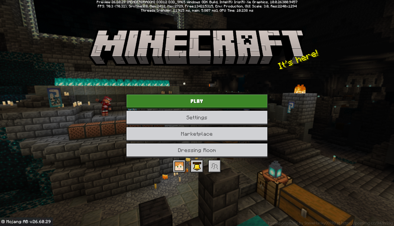
    Here is SteveHanky00199's concept of what the Main Menu should actually look like:

  • 5
    Registered User commented
    Comment actions Permalink

    Revert the change.

  • 12
    Registered User commented
    Comment actions Permalink

    Im sorry, but its HORRIBLE
    - The proportion is weird, player looks really BIG

    - Please stop the OreUI-ification
    Its laggy, Its uncustomizable. Please just stick to JSON UI, If it ain't broke dont fix it

    - MINECRAFT LOGO MISSING Feels so weird, its iconic why did it get removed? Especially the funny splash text

    - And the most important, WHY SETTING BUTTON IS SACRIFICED FOR MARKETPLACE BUTTON

  • 4
    Registered User commented
    Comment actions Permalink

    The initial loading screen for the main menu is really unnecessary. There's already one when you open the game! Unless it's for the login process (to make sure online features work and to fix several related bugs) or for a future in-game hotfix system (wishful thinking), it should be merged with the startup screen.

  • 9
    Registered User commented
    Comment actions Permalink

    You learned this with the in game pause menu, the settings button should never be hidden off to the side, with the amount you guys already boost the marketplace all we want is settings to be in a common sense place, also give us the Minecraft logo back it’s good to see there it’s dumb you guys replaced it

  • 5
    Registered User commented
    Comment actions Permalink

    There are a lot of things that could be improved; the main menu is the most important interface in the entire game, it can't be taken lightly.

    • The Minecraft's logo is missing.

    • The buttons should be in the middle and placed in this order due to their importance: Play > settings > marketplace > dressing room.

    • There shouldn't be loading screen, It's annoying.

    • The button to view your profile is missing.

    As a veteran Bedrock Edition player, I hope the main menu to be in the best and most user-friendly form possible.

    With love to the Mojang team, Duby.

  • 4
    Registered User commented
    Comment actions Permalink

    I was okay with the other OreUI revisions but this one is certainly the most baffling. Where is the logo? Why is everything, like, offset? It feels a little confusing. OreUI itself I'm fine with, but the rearrangement of the main menu is just so weird. Keep everything centered please, and stop trying to hide the settings button! I thought we learned this the last time, with the pause menu? My goodness.

  • 4
    Registered User commented
    Comment actions Permalink

    The current menu is way better so the menu does not need updating, this new one is uncomfortable on my eyes to focus on the left hand side instead of the middle. The settings button is very hard to see and should be under the play button. the classic Minecraft logo and splash text shouldn't be removed. The skin character to the right is way to big in comparison to the buttons which makes it uncomfortable to focus and see the background.

    Please keep the current menu "if it ain't broken don't fix it" 

  • 3
    Registered User commented
    Comment actions Permalink

    Why are there now three loading screens?

    First the red one the the old gray one and last and finally least the new one where the panorama is visible.
    I like the new one, and I think it would be a huge improvement if the second one could be removed. This would lead to a cleaner, simpler and visually appealing experience.

    I hope you will consider this.

  • 8
    Registered User commented
    Comment actions Permalink

    It looks awful, the buttons should be centered, the Minecraft logo NEEDS to be visible, and put the settings button back to where it was, no one is trying to go to the dressing room instantly. It doesn't need to be a main button. Make the skin smaller like how it was and put the dressing room button back to where it belongs. Shake my head Mojang. People want a good menu that functions, not one that's just micro transaction slop. I give this new menu a 3/10, the old one was like a 4.5/10. Please make the layout better, please.

  • 6
    Registered User commented
    Comment actions Permalink

    In any scenario, the old menu is infinitely better than this one

  • 4
    Registered User commented
    Comment actions Permalink

    Theres no reason to replace settings with the avatar button, if you hadn't tried to almost get rid of it on the pause screen a few months back I wouldn't have even known where it was despite the importance of being able to change settings. We don't need a form of the marketplace button replacing the settings *again*

  • 6
    Registered User commented
    Comment actions Permalink

    There is easily room to make more important buttons larger. I believe Settings should be a large button directly between Play and Dressing Room. Remove the Marketplace button, make it a small button like Mail. If you absolutely MUST have Marketplace be a big button, put it at the bottom of the list. You could also include a Multiplayer button that takes you to a list of realms and servers. Or add a purple Realms button below Play, and a light-blue Servers button below Realms, for a splash of colour.

    For controller navigation, I feel having buttons in the top corner wouldn't work. I'd place the two small square buttons directly under the big list, alongside two additional small ones. The list of buttons should be one for marketplace, one for mail, one for social, and one for screenshots.

    Overall, it should look something like:

    - PLAY

    - Realms (Maybe?)

    - Servers

    - Settings

    - Dressing Room

    -🏪    -✉️   -👥   -📷


    Moving away from buttons, I believe there is a lot of empty space. The Minecraft Logo being absent makes the screen look empty, and the logo seen on the loading screen looks oddly squashed. Or stretched horizontally. I like the idea, but having the logo move into a position where it was before instead of fading away would be ideal. I prefer the layout how it was originally, but if that's not coming back, just having the logo in the corner above the list of buttons would be fine. If there are too many UI elements for certain mobile devices, maybe the logo can disappear or shrink.

  • 4
    Registered User commented
    Comment actions Permalink

    In my opinion, the logo should never invisible in the main menu. It is unacceptable to see that there is no Minecraft logo in Minecraft.

  • 9
    Registered User commented
    Comment actions Permalink

    SKIN TOO BIG, The dressing room button should be under the skin and like a icon,minecraft logo???,messy background,use the space for worlds servers and not ads

     I am playing minecraft bedrock not that much becaause the ads and like that but with the new screen...Fix it or I wont play bedrock anymore

  • 7
    Registered User commented
    Comment actions Permalink

    I hate it, please keep the old one, the new one doesn't show the big Minecraft logo on the top of the screen, the buttons are on the left, which I don't like, like the other guy said, the player's skin is WAY too big, in my opinion, the old one is already great, just make the player skin a little bit bigger, not like a giant or something and MOST IMPORTANT

    WHY WAS THE SETTINGS SACRIFICED FOR THE MARKETPLACE!?!?!?!?!?! I HATE THAT!! I ABSOLUTELY HATE THAT!! AND RESOURCE PACKS WONT BE ABLE TO CUSTOMISE THE MAIN MENU IF EVERYTHING IS OREUI!!!
    Sorry if I misspelled something, english isn't my normal language

  • 3
    Registered User commented
    Comment actions Permalink

    As an honest feedback, I think the updated main menu really lacks the atmosphere of Minecraft and feels a bit cheap. The original title screen has been the best of all time, and there's no need to change it this way. The settings button is so much harder to find. The skin display is a good feature, but it just doesn't need to be this big. And the biggest of all, title screen of Minecraft has been always with the Minecraft logo on top center, and the options on the center. It was the iconic and very Minecraft-y design, everyone liked it and no one disliked it. Also, I don't understand why some empty spaces are unnaturally placed in the new design. I hope the title screen keeps the way the original one was designed. Probably some UI can be changed for better performance and design, but the concept of Minecraft title screen should definitely be kept the way it is now.

  • 3
    Registered User commented
    Comment actions Permalink

    KEEP IT THE OLD WAY PLEASE! The dressing room being below your skin just makes more sense! This is not necessary at all!

  • 2
    Registered User commented
    Comment actions Permalink

    I think it would be better if at least we could change back to the old UI from the settings.

  • 5
    Registered User commented
    Comment actions Permalink

    This interface definitely makes the experience worse for console players—because let's be honest, it was designed solely with mobile players in mind. On top of that, I don't know why anyone thought it was a good idea to place the settings button where it's easily overlooked, or why removing the profile view button makes an already insignificant feature even more irrelevant; it’s clear they prioritized the Marketplace over creating a good interface.


  • 3
    Registered User commented
    Comment actions Permalink

    It would be great if they let us choose between two interfaces: one similar to what we had before and another being this new one—or better yet, simply not make unnecessary changes. As a console player, I’m going to find this extremely difficult to use comfortably due to the highly questionable design choices; for instance, dedicating a specific section to Marketplace ads strikes me as a really bad idea.

  • 0
    Registered User commented
    Comment actions Permalink

    The left main menu replaces Settings with Dressing room.

    Settings is a game's most basic, high-frequency entry. Whether adjusting FOV, volume, graphics, or keybinds, players need quick access. Removing it from the main menu while putting a low-frequency decorative feature like Dressing room on the top level neglects player experience. The right design puts Settings back and tucks Dressing room into the top-right icon, matching normal gaming logic.

    Dressing room is tied to Marketplace to sell skins and character parts. Forcing it onto the main menu tries to increase time spent in customization, but it makes the menu look like a noisy app store or dress-up app rather than the gateway to adventure. Players want to Play first, not change clothes.

    The left uses a traditional three-column flat stack: Play, Marketplace, Dressing room. It is visually top-heavy and strips away Settings, creating an unhealthy hierarchy. The right uses a minimalist hanger icon for Dressing room. This follows modern UI principles and keeps the menu clean, making Play and basic operations like Settings and Marketplace more reasonable.

    Players do not reject Dressing room; they reject its overwhelming occupation of the core entry. The right design points out the crux: a main menu should serve gameplay, not monetization.

    I hope the team listens to the community, stops using the main menu as a commercial billboard, returns Settings to players, and puts Dressing room back in the corner where it belongs.

  • 7
    Registered User commented
    Comment actions Permalink

    Please dont do this. Im fine with the discovery thing you guys are planning to add as long as the main menu stays. Also the new server menu is cool but the current one we have is just better.

  • 4
    Registered User commented
    Comment actions Permalink

    I play primarily on mobile and am not a fan of this change to the layout I don't mind the player skin preview being bigger but I really prefer everything else be the same layout as before

  • 2
    Registered User commented
    Comment actions Permalink

    セーブして続けるの機能を復活して欲しい

  • 2
    Registered User commented
    Comment actions Permalink

    This looks more like a pause screen. The buttons and Minecraft logo should be centered, and the player skin does not need to be this large.

    For the main options, I think the layout should stay simple:

    PLAY
    SETTINGS
    REALMS
    DRESSING ROOM

    The Marketplace button could remain as a small button at the top.

    There are also far too many Marketplace buttons throughout the UI. If players want to browse or purchase something, they can access the Marketplace themselves. One easily accessible button is enough.

    Adding more Marketplace promotions and purchase-focused elements can make the game feel overly monetized and create further frustration among players. Instead of encouraging purchases, this can negatively affect how players perceive the UI and the overall direction of the game. Please take player feedback seriously and focus on what players actually want.

    Please also avoid turning the menu into a Roblox/Fortnite-style interface. Minecraft's simple and recognizable design is iconic, and the UI should preserve that identity instead of becoming overly polished and focused on monetization.

    I also suggest removing the advertisements that appear after selecting "Create World", along with unnecessary advertisements elsewhere. If players want to buy something, they will do so on their own. One Marketplace button is enough.

  • 4
    Registered User commented
    Comment actions Permalink

    minecraftのロゴが表示されていない、スプラッシュテキストがないことで今までのマイクラらしさが無くなったように思えます。それと、PS4で統合版をプレイしている場合、コンソール版を起動するボタンがあるはずですがそれはどこに表示されますか?

  • 6
    Registered User commented
    Comment actions Permalink

    This is straight up predatory. Marketplace should not replace the settings button. Please behave like humans, and not like corporate machines trying to squeeze money out of people. If people want to buy, they'll buy. Don't be evil and predatory.

  • 4
    Registered User commented
    Comment actions Permalink

    The buttons are so small, the character is way too big, and the only buttons on the main part of the screen are play and two "give us money!" buttons. Not to mention when you scroll, you just get put right into the marketplace. The settings button is more important and shouldn't be put away from the rest.

  • 5
    Registered User commented
    Comment actions Permalink

    This new UI looks just terrible, there is too much empty space that will probably be used to shove ads into your face which isn’t a good at all. Also the fact that the settings button is back to being a super small button that is easily missable is also horrible since everyone already gave there opinion on it when it was changed in the pause menu. If you really want to make a UI change either don’t make one entirely or give people the option to choose where they want the buttons to be placed and how big they want them to be. Plus why is the skin so big it’s very unnecessary and looks bad.
    So in short don’t touch the bedrock UI at all it’s already good enough as it is except the create world button having that ad pop up is another thing that annoys me personally very much. Hopefully you will listen to everyone’s feedback and not go through with this change since it frankly looks like a bad mobile game interface.