Discuss Minecraft's user interface, menus, settings, and input methods. Share feedback on navigation, controls, accessibility, customization, and other features that affect how players interact with the game.

20

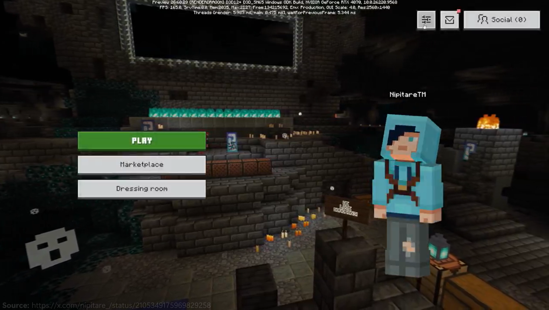
Let's talk about updated main menu (Bedrock)

Pinned

25 Comments

Post a new comment:

Please sign in to leave a comment.

Sorted by oldest
  • 13
    Registered User commented
    Comment actions Permalink

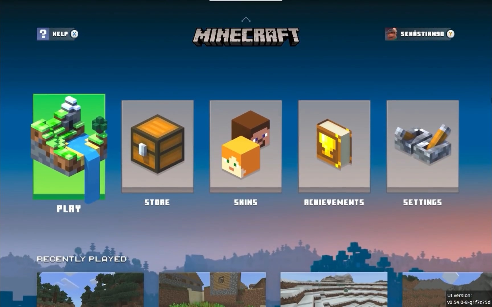
    The settings button is really easy to miss. It should be a larger button alongside/directly below the play button imo. I miss the Minecraft Logo being shown on the main menu (including the splash text). The menu is more bland than the last one aswell. Missed opportunity to go the minecraft legends route with title cards and icons for the main buttons on the main menu instead of the marketplace being the only colourful button on screen.

  • 23
    Registered User commented
    Comment actions Permalink

    I'm sorry but the updated main menu looks horrible. Here is why:

    • The logo should be always visible at the top of the screen. Hiding it makes it seem like you're not proud of showcasing this is "Minecraft".
    • The main buttons should be centered, not offset to the left
    • Moving the Settings button to the top right edge and replacing it with 2 "buy stuff" buttons (Marketplace and Dressing room) in incredibly predatory. I'm disappointed that the team learned nothing from the pause screen fiasco from a few months earlier.
    • The character skin preview is too big and takes too much space on the screen
    • the version number should always be visible in the bottom left.

    I couldn't be more disappointed in what's been shipped today. Please do better.

  • 9
    Registered User commented
    Comment actions Permalink

    In my opinion, the buttons should still be in the middle and the logo shouldn't fade out at all

  • 7
    Registered User commented
    Comment actions Permalink

    The new main menu objectively looks much more horrible and I suggest you should revert it to the original, or at least keep the buttons and the interface in the same place with updated button textures.

    In my opinion, it is totally DISSAPOINTING.

  • 7
    Registered User commented
    Comment actions Permalink

    I have some feedback indeed to tell:

    • I don't like that Minecraft's logo is fully missing from the menu bedside from the loading screen, it also misses the iconic splash texts.
    • Why the player avatar is so big? I get that in mobile this will be positive for players but I feel like this in PC or a TV screen it is unnecessarily big, it should have different sizes depending on the device or just make it a lot more smaller btu keeping it big on phones.
    • Once again as the last time this happened on the pause menu, why a Dressing or Marketplace button should be bigger than the Options button, that is btw one of the most important part of a game specially if you have to be changing graphical or key binds settings all the time?
    • For last if I'm not forgetting something, I feel like the buttons should be placed more closed to the left side or just be a bit bigger and move them a bit more to the left too because for now they look like they didn't found well their place on the screen.

    I hope they continue iterating the new OreUI menu based on community feedback, because while I like the idea the team has, the execution for now it's not the best one. And I love the look OreUI has, but this is not it's best version by far for Minecraft's Main Menu.

    —ElMinehuy

  • 6
    Registered User commented
    Comment actions Permalink

    The new menu looks quite empty without the Minecraft logo; it should be above the buttons, as it always was. The settings button should be grouped with the others and include text. Please add a shortcut for recently played worlds. The skin preview looks too big.

  • 9
    Registered User commented
    Comment actions Permalink

    >improved performance

    Let's not lie, please. It takes multiple seconds to load, which is unacceptable. User interface should be instant and responsive.

  • 8
    Registered User commented
    Comment actions Permalink

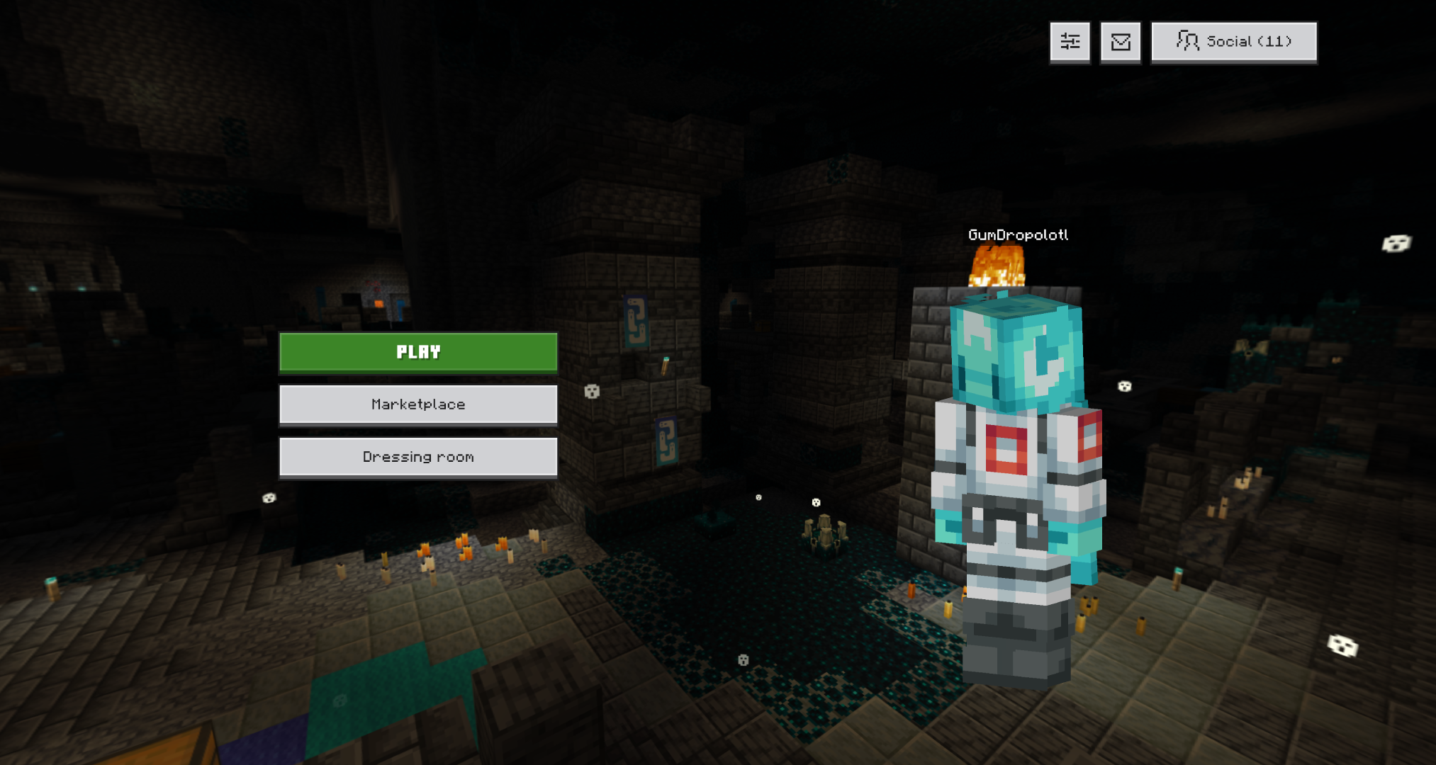
    Awful in almost every way. So much empty space, the lack of a Minecraft logo, the settings button being on the top instead of front and center, and the paper doll appearing way too large. Not to mention that there'll be ads added to this main menu screen in the future. Ads in Minecraft are just showing the amount of corporate slop that's being injected into Bedrock.
  • 9
    Registered User commented
    Comment actions Permalink

    absolutely terrible design. 

    the old layout was so much better look and feel wise and the buttons being center with the games logo above with the player on the right was so iconic that you guys have basically lost the plot 

  • 8
    Registered User commented
    Comment actions Permalink

    The logo should be visible always

  • 6
    Registered User commented
    Comment actions Permalink

    Just awful, why even remove the logo, and why remove the settings button AGAIN

  • 6
    Registered User commented
    Comment actions Permalink

    I'm going to be honest, but the current old UI is far better as it now than whatever Mojang put in the beta. My suggestion is to transfer the classic button UI into the new Ore UI look, keeping the positions of everything as it is- or better, have this menu be fully customizable. Minecraft is about having it YOUR way, and the massive lack of customization of UIs is honestly a major surprise to me.

  • 7
    Registered User commented
    Comment actions Permalink

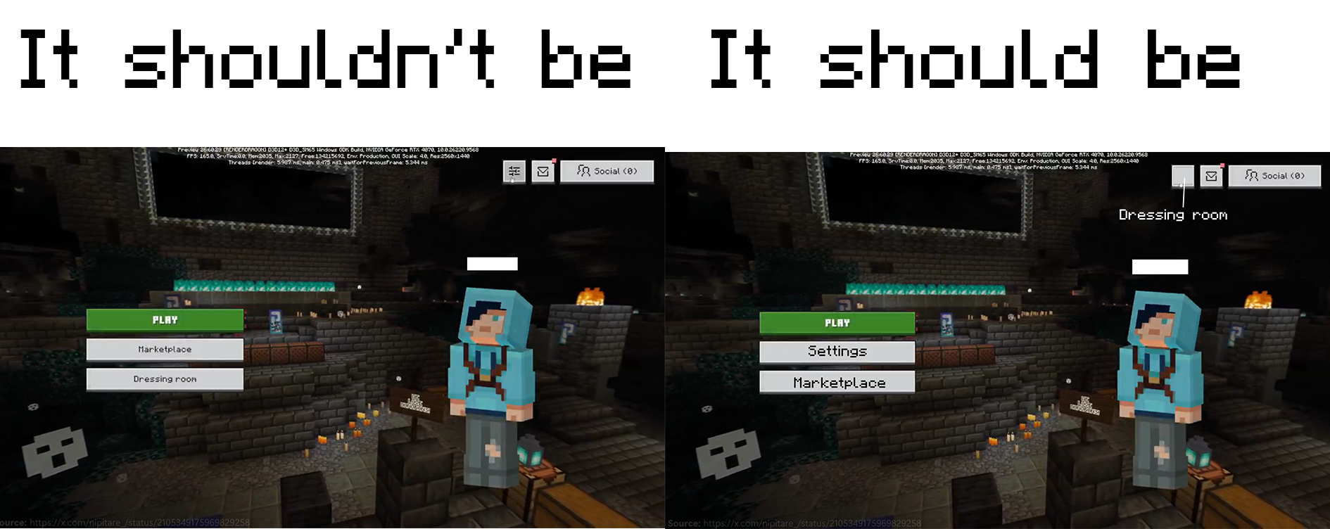
    In my opinion, Macketplace and Dressing room never take priority over Settings. Because Settings used more commonly than Macketplace and Dressing room.

    Therefore, Settings should be under the "PLAY" button, Macketplace is under the Settings, and the "Dressing room" is instead of the old Settings.

    Like this:
  • 10
    Registered User commented
    Comment actions Permalink

    This UI is a downgrade in every single way. It's completely ignoring past feedback by once again making the settings button tiny despite how much people hated that with the pause menu, just for the sake of a SECOND BIG MARKETPLACE BUTTON (since the dressing room is directly connected to the marketplace)?! 

    The player skin character is way too big. There's no reason to have the important buttons not be centered. The settings button should not be that tiny. The dressing room button should not be one of the big buttons and should just be like it was before. Why is the Minecraft logo gone, why is the splash text gone, why is the version number gone?! 

    This UI removes all the things that people might ACTUALLY want in the main menu just for the sake of putting in what's essentially a second marketplace button (which, mind you, was already present before, but in a far more reasonable spot). I can't see any positives with this UI change but there's way too many negatives. 

  • 6
    Registered User commented
    Comment actions Permalink

    You really want people to spend money on the marketplace do ya, yeah no this "updated menu" ain't it at all

  • 8
    Registered User commented
    Comment actions Permalink

    This is such bad UI design that I'm genuinely struggling for words. The buttons need to be larger, the settings button is not visible enough (and the marketplace being prioritized over settings again is a disgrace), the skin is just too large and the dressing room button fits much better below it than elsewhere on the screen, and for some reason the title of the game is absent from the menu (alongside splash texts, which are one of the most iconic elements of Minecraft's main menu).

    This entire menu looks like a temporary placeholder. I can't fathom how you could even consider shipping this in any capacity.

  • 6
    Registered User commented
    Comment actions Permalink

    The buttons look too small. There should be a Minecraft Logo. The player looks way too big. I don't mind more of the screen being taken up but making the player fill that gap on the other side doesn't look right. I don't really want to have lots of things for the marketplace and realms but I wouldn't mind a quick way to access the last world you have been on. I would't mind something very different the current title screen but if it is going to be quite similar I think this attached image might just be best since it is a least a bit of a less messy version of the old one.

  • 5
    Registered User commented
    Comment actions Permalink

    The new and updated menu can be best described as a round 2 of the controversial changes not even a year ago. Here's a short list of why it's awful:

    1. Settings button, the first thing I always look for on a fresh install of any game to see it's defaults and turn off unwanted features that are optional, is not only tiny, but shoved into a corner where it is easy to overlook. It took me a full minute to find it, which is atrocious UI design.
    2. Below the Play game button are 2 separate buttons that point you to marketplace. Extremely predátory. Shoving it down the throat of the playerbase will not get anyone to use it. This is one of the many, many big reasons MCBE is shunned or ignored by anyone with prolonged experience with Java edition.
    3. The character preview is Windows 8 levels of wasteful with screen estate, which is not a statement I throw around randomly. Seriously, cut the size of the element down to at least 1/5 of it's current height and width
    4. There's no reason or benefit to completely hide the current game version. In fact, I don't even know where that number would show up on a release build.
    5. Make the ore UI customizable, hardcoding the Main menu UI and locking it out of customization is just a terrible move, as it can no longer be thematically consistent with any resource pack.

    I can't even think of anything to make this worse.

  • 5
    Registered User commented
    Comment actions Permalink

    There should be no reason for the Minecraft logo to be missing from the main menu. The buttons should also be centered as well, although I do like that they are wider and shorter like the Java buttons. Also, you can at least try to hide the fact that you want players to buy from the marketplace so bad by moving the settings button between that and the play button. I also think that the dressing room button should be replaced with a profile button, which takes you to your profile and you can then access the dressing room from there. I feel like I don't change my character/skin as much as I change my settings - that may just be me though, so I'd like to hear what others have to say about that.

  • 4
    Registered User commented
    Comment actions Permalink

    Please don't remove the logo from the title screen.
    In fact, this would be a great opportunity to introduce the animated Mojang and Minecraft logos that are often used in the official Minecraft videos.

  • 4
    Registered User commented
    Comment actions Permalink

    I loaded up the preview to check out the Ice Caves but before I could check it out, I was met with this absolute abomination. I am lost for words how this is accepted for the main version of Minecraft. Yes, this is preview but I expected more than this slop. 

    Current Issues with the menu:

    - The buttons on the top right aren't anchored correctly to the top right of the screen, so when changing the GUI scale, the buttons stay between the top center and top right of the screen - making them look out of place.

    - As well as the player icon not being resized correctly when changing GUI scales.

    The current implementation of this menu looks like a quick/temporary change without any thoughts or consideration on the player's needs.

    Important and necessary changes:

    - Title - You are planning to release this main menu to the main version of the game without the games name. I don't understand how that is missed. I can understand the splash texts but the title HAS to be on the main screen centered at the top, like it has always been.

    - Settings Button - As an addon-creator, I am constantly testing out addons in worlds. It is crucial for me to easily access the important tools only accessible in the settings, like the storage/pack settings and creator settings.

    - Player Icon - One of the least important things, yet the most biggest thing on the screen, which contrasts to my tiny player name above it when using GUI scale at 50%.

    - Version Number - Need to know what version of Minecraft I am playing.

  • 3
    Registered User commented
    Comment actions Permalink

    Keep the current bedrock layout. Just change to OreUI. I don't know what their plan is. But the character is way too big, setting button is having the same deal they did with the pause menu. Pause menu actually looks good though. Main menu doesn't need to look like it.

  • 2
    Registered User commented
    Comment actions Permalink

    I'm sorry but this new main menu is absolutely horrible, why would you choose this new one over the current release version one? The current one is much better than this.

    This new one is like the ingame pause menu except bad. The layout doesn't fit the title screen, and choosing to make the marketplace one of the main buttons and not the settings button--something users already criticized you for in the pause menu, which you later went back on (so why is it being tried again here?)--is really bad.

    Plus why does the title/logo disappear? It's the title screen! It's supposed to stay there! Why would you remove it and the iconic splash texts from the opening menu??? The difference between this menu and the current one is night and day, I can't tell if they genuinely wanted it or if some out of touch businessman in charge made them do it (especially since it's been found out you guys plan to shove ads into this menu).

  • 1
    Registered User commented
    Comment actions Permalink

    i cant find any good things to say. none of it is an improvement. none. i genuinely think that a completely AI built menu with no human oversight would make more sensible choices.

    ignoring the elephant in the room with teeny settings, the character is too big. minecraft logo is missing. text on buttons is small. version number is gone. (really important information!) i could go on.

    please dont put this to main menu on proper versions.

    (also probably controversal i like colourful marketplace button)

  • 0
    Registered User commented
    Comment actions Permalink

    By moving the settings into the corner (and just having the symbol instead of labeling it properly) the game is *less* accessible. Settings should always be easy to find for the people who need it! Let's say for instance, you're visually impaired. You can make the GUI bigger in the settings, but you have to be able to FIND THE SETTINGS!

    Also, why would you remove the logo? Yeah we know we're in Minecraft we don't *need* it but the logo has been there since before the panorama, and we lose the blurbs too? Lame.

    I actually like the paper doll (I spend more time in the dressing room than the game some days) but it should be sized according to the device you're playing on. Phone and switch can use the bigger display but I play Xbox and could see it just fine before. And if we're committed to this split menu look, the dressing room button should really be lined up with the paper doll, not where the SETTINGS button should be.

    Overall this feels really unfinished (which I know it is) but having 2 "give us money" buttons feels really bad when there isn't much else to look at. Giving the social menu, notifications, and settings more visual weight helped to balance it out.