We welcome feedback about menus, toggles on menus, buttons on menus, input devices (like touch controls and keyboards), and Minecraft’s interface. How do you play? What would make it better?

17

Let's talk about updated Bedrock Tooltips

Pinned

21 Comments

Post a new comment:

Please sign in to leave a comment.

Sorted by oldest
  • 6
    Registered User commented
    Comment actions Permalink

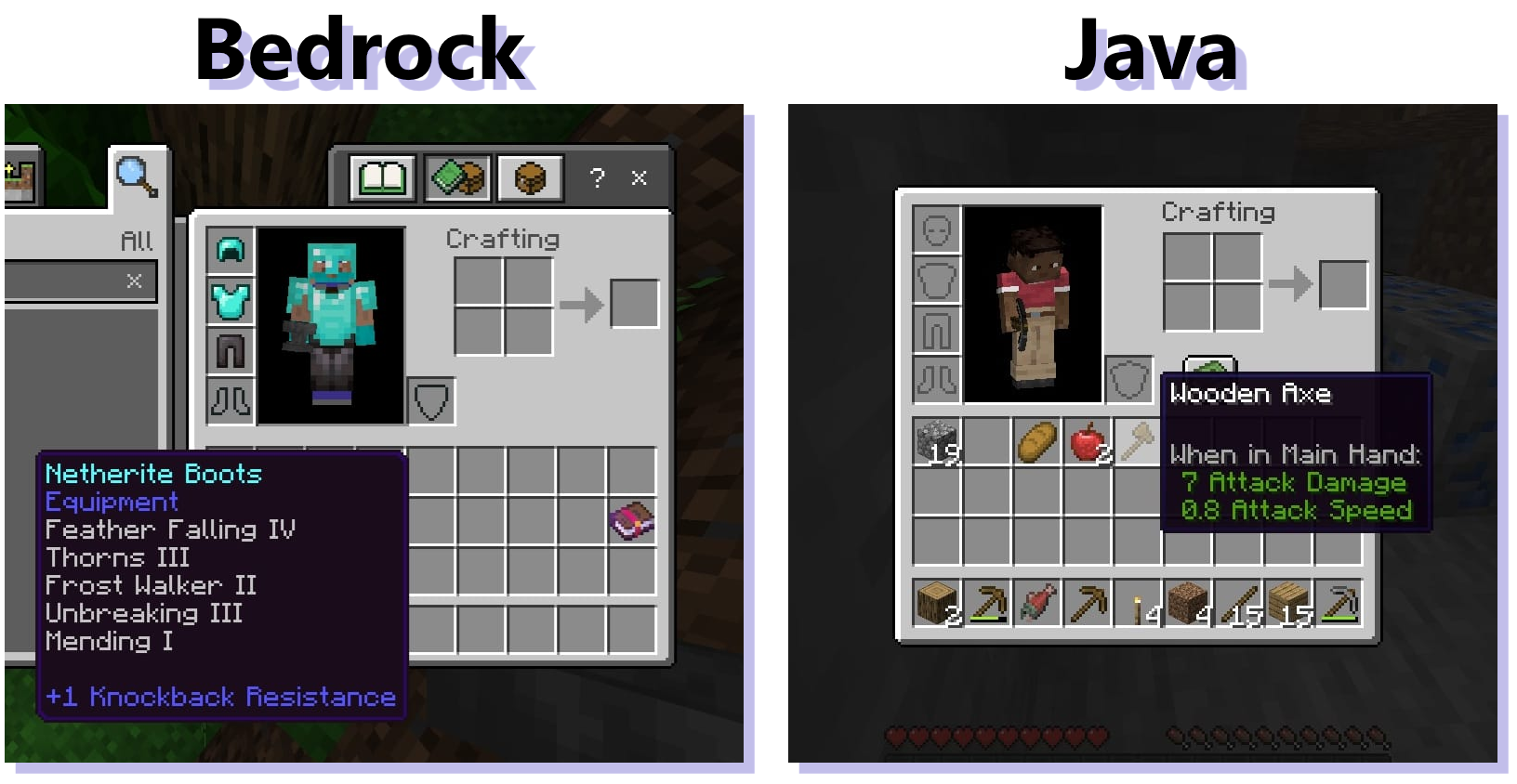
    While the updates to tooltips are helpful, there is an underlying issue that is made worse with this change. The tooltip texture is opaque on Bedrock, unlike Java's, which are transparent.

    This means that large tooltips, like those that contain enchantments, obscure most of the crafting interface which ultimately reduces visibility. This issue has only gotten worse with time ever since bundles were introduced and now with this change, the inventory will be much harder to navigate.
  • 4
    Registered User commented
    Comment actions Permalink

    Copper Chests which currently have no tooltips should say: "Storage and Sorting"

  • 2
    Registered User commented
    Comment actions Permalink

    Items should use descriptions from the Legacy Console Editions. So for example Cobblestone would say in its tooltip: “ Mined from stone using a pickaxe. Can be used to construct a furnace or stone tools.”

  • 3
    Registered User commented
    Comment actions Permalink

    Lightning rods should also say in their tooltip: “Used to divert lightning strikes.”

  • 2
    Registered User commented
    Comment actions Permalink

    I'm not a big fan of these. I don't like when the game tells me how things work, it feels condescending and noisy. Just my opinion.

  • 4
    Registered User commented
    Comment actions Permalink

    It’s a good addition for new players, but it would be annoying for most people. Please add a setting to turn the tooltips off or customise them in some way.

  • 5
    Registered User commented
    Comment actions Permalink

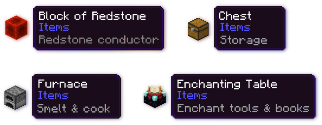
    At least on the preview/beta version of the game, this change scrubs every item of its tooltips which shows what creative tab it's found in, which is a not very helpful. For example, a grass block won't show that it's in the "Nature" tab via its tooltip anymore.

    I think the better solution is that the tool tips should show both the tab the block is found in (ex: Construction, Equipment, Items, Nature) with the standard purple text and then show the extended tooltip info (ex: Smelt & cook, Redstone powered, Upgrade tools & armor, Brew potions) in grey text. This would improve readability, match Java more accurately, and is way more helpful than before.

    Here is an example of what this could look like:
  • 3
    Registered User commented
    Comment actions Permalink

    I believe these should be toggable

  • 3
    Registered User commented
    Comment actions Permalink

    The redstone components' tooltips will be immensely useful. Please flesh the rest of these out. Honey Blocks and Slime Blocks should get a description, too.

    Please add tooltips to items that have contextual or unintuitive interactions, or which have interactions with prerequisites. Such items are Bone Meal, Totem of Undying, Bookshelf, Lodestone, Sponge, Ender Chest, and Campfire.

    In my opinion, tooltips should be removed from items with functionality that requires little to no context to use. Blocks like Chest, Crafting Table, Furnace, Grindstone, Loom, etc. are all items that either describe their usage by their name, or would require one interaction (with no other prerequisites) to observe their behavior.

    And expose this as a data-driven component, please! Allow creators to assign tooltips to their items without hassle.

  • 4
    Registered User commented
    Comment actions Permalink

    Personally, I'm not a fan of the removal of the Item Categories and feel like they should be readded. And instead the description be the "Lore" component instead on tooltips. This way they could be added to Java Edition as well.

    I'm also not a fan of the removal of these lore components:
    Smithing Template lore
    When Applied Text on Tipped Arrows & Suspicious Stew
    Upgrade Text and Trim Material on Trimmed Armor
    All of When (...) fields are

    As they provided helpful context on their respective Lore/Item(s).

    Since the tooltips are being modified, I feel like it's worth adding the other missing lore that Java Edition has for parity. Some of which will require an advanced tooltips toggle added:

    Bucket of Tropical Fish should be renamed to Bucket of Tropical Fish instead of Bucket of [Fish Pattern]. And fish pattern should be moved to the lore.
    Maps should just be named Map instead of [Map ID/Unknown Map] and they should be moved to the lore. Scaling is also missing.
    Number of Bees is missing from the lore of Beehives/Bee Nests
    Projectile lore is missing from a Charged Crossbow
    Hex Color Code is missing from dyed leather armor. (Advanced tooltips)
    When in Main Hand field is missing for stuff like Swords, the attribute lore is listed though.
    Honey Amount is missing from the lore of Beehives/Bee Nests
    Durability is missing from the lore. (Advanced tooltips req.)
    Item ID is missing from the lore. (Advanced tooltips req.)
    Monster spawner is missing Interact with spawn eggs
    Disabled in peaceful is missing


  • 4
    Registered User commented
    Comment actions Permalink

    These are great & while we're at it can you people please make the tooltip hover text on the HUD not show enchantments & contents just like it's on java, I mean it is very annoying sometimes it covers up the screen, also you should add a slider to adjust their transparency in the inventory.

  • 2
    Registered User commented
    Comment actions Permalink

    I think the concept of this change is good, however the Tooltip change I really want to see is to make the Hotbar Tooltips show only the item name, and nothing else. Right now every time I switch to my maxed Netherite spear the Tooltip extends up two or three times the normal width of the Hotbar. Even if I set the background to be transparent, all that floating text in the middle of my screen is very distracting. It would be much better if it only showed the item's name, unless you are in your inventory screen of course.

    (Aeglos was the spear of the elven-king Gil-galad. It meant "Snow-point" or "Icicle", and is mentioned in The Silmarillion. Just in case you're looking for a good spear name.)

  • 2
    Registered User commented
    Comment actions Permalink

    Making the new tooltip descriptions purple is really distracting and makes it seem like they are more important then the item categories like nature, items, equipment. The new tooltips should be changed to a grey color like someone suggested above while the old categories should be restored and be purple.

  • 2
    Registered User commented
    Comment actions Permalink

    In my view, the new Tooltip is a BAD design, as follow:

    A.The tooltip is NOT the most wanted info when a user hovers his mouse onto certain item. For e.g, a furnance has no difference with another furnance, this "furnance property" is straightly seen in the texture as soon as you open your backpack. When hover, what we want to know most, is like "Is this item renamed on an anvil?" or anything that makes this item SPECIAL. However, the new tooltip greatly distracts users' focus, which is a poor design.

    B.All minecraft items have simple and straight usage when designed them, thus we don't need a 2~3 word tooltip with almost NO info. If these describe is simple, a player might learn the usage in like minutes, making the describe useless. If these describe are complex, then why not simply add a button in inventory, directing to the "How to play" menu?

    C.There is already a "How to play" menu with more detailed description. For e.g, when a player checks a redstone block and a redstone torch, they aren't satisfied of blur tooltip like "Redstone signal", they want to know HOW and HOW MUCH they produce signal, then they have to check "How to play" menu or Wiki, making the tooltip useless.

    D.Art and Playstyle Disaster. Not every item have tooltip, then there must have a unconvience to manage your backpack, since the UI will be longer and shorter. And, the more text there is, the less interest the players get.

    E.Working stations shall have BETTER and NATURAL ways to illuse their usage 

  • 1
    Registered User commented
    Comment actions Permalink

    Minecraft is a game of explore, not a game of texts. I don't want a block wiki in my inventory.

  • 3
    Registered User commented
    Comment actions Permalink

    Thank you so much Mojang for updated tooltips - its really nice even for OG fans to have cauldron, barrel, chest, crafting table and any other to have small text that tells what they can do, I love it <3

  • 1
    Registered User commented
    Comment actions Permalink

    Please bring back the item categories that told you what tab a block could be found in! There was literally no reason to remove them for wordy descriptions!

  • 2
    Registered User commented
    Comment actions Permalink

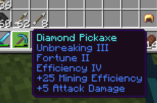
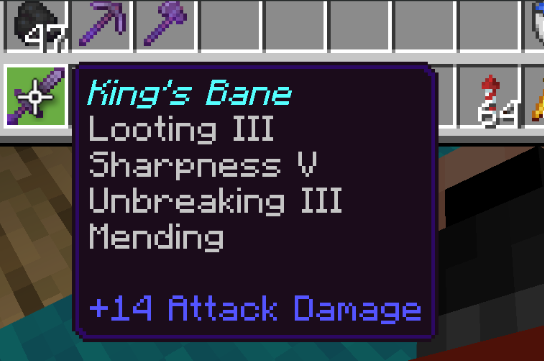
    Although I do like the new information I guess I'm very much not a fan of all of enchantment text being in this blue color, it makes it very hard to look at and kind of off putting and all the information kind of blends together. The gap being gone between the enchantment text and the modifier descriptions ads to issue of being difficult to look at.

    Preview
    Live
  • 2
    Registered User commented
    Comment actions Permalink

    Overall, i like the addition of in-game information that tells you what something does. But i feel like it would be nice to be able to toggle the tooltips off if you don't want them (as they do add text clutter to the inventory), and also having a full description for things that we can view, like in Legacy Console, as tooltips may be too simple to properly explain the functionality of some things. 

  • 1
    Registered User commented
    Comment actions Permalink

    i find this great some reasons

  • 0
    Registered User commented
    Comment actions Permalink

    People just down there commenting just be hating for no reason this is why we're never getting good parity cause you spoil people be hating on everything