In the latest Bedrock Preview, we've introduced updates to the Tooltips for selected blocks.
Examples include:
- Furnace – Smelt & cook
- Blast Furnace – Smelt metal faster
- Smithing Table – Upgrade tools & armor
This is an early version, and we're still refining the wording and deciding which block functions are most important to highlight.
We would love to hear your thoughts on those changes. Here are a few questions that might help you provide the feedback:
- Are these descriptions helpful?
- Do they highlight the most useful function of each block?
- Are there any you would change?
Your input helps shape future updates, so join the discussion in the comments and tell us what works, what doesn't, and what you'd like to see improved.
35 Comments
Please sign in to leave a comment.
-
While the updates to tooltips are helpful, there is an underlying issue that is made worse with this change. The tooltip texture is opaque on Bedrock, unlike Java's, which are transparent.
This means that large tooltips, like those that contain enchantments, obscure most of the crafting interface which ultimately reduces visibility. This issue has only gotten worse with time ever since bundles were introduced and now with this change, the inventory will be much harder to navigate.
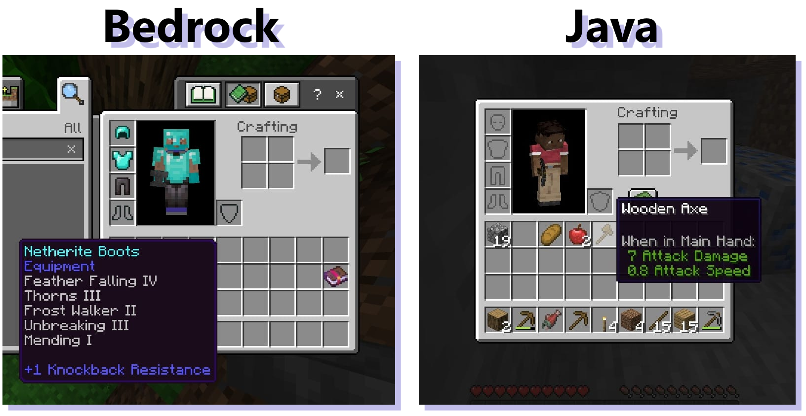
At least on the preview/beta version of the game, this change scrubs every item of its tooltips which shows what creative tab it's found in, which is a not very helpful. For example, a grass block won't show that it's in the "Nature" tab via its tooltip anymore.
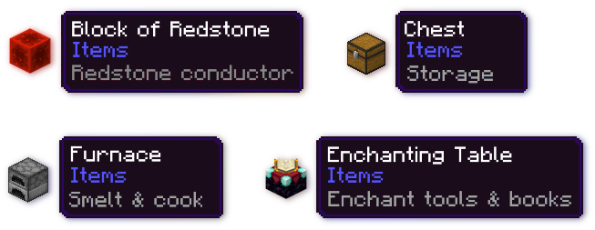
I think the better solution is that the tool tips should show both the tab the block is found in (ex: Construction, Equipment, Items, Nature) with the standard purple text and then show the extended tooltip info (ex: Smelt & cook, Redstone powered, Upgrade tools & armor, Brew potions) in grey text. This would improve readability, match Java more accurately, and is way more helpful than before.
Here is an example of what this could look like:
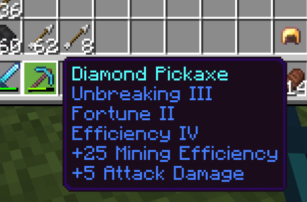
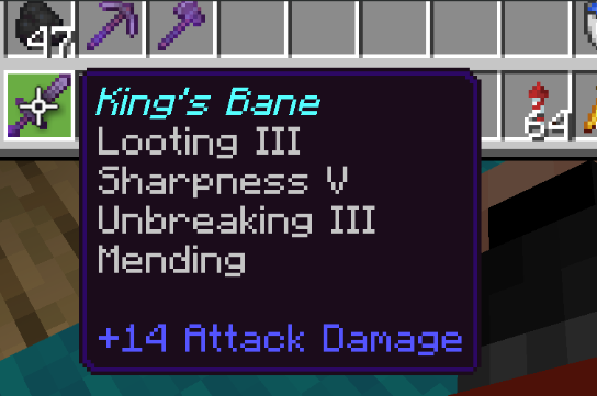
Although I do like the new information I guess I'm very much not a fan of all of enchantment text being in this blue color, it makes it very hard to look at and kind of off putting and all the information kind of blends together. The gap being gone between the enchantment text and the modifier descriptions ads to issue of being difficult to look at.
Preview
Live
Post a new comment: