Sign in
Skip to main content

Discuss Minecraft's user interface, menus, settings, and input methods. Share feedback on navigation, controls, accessibility, customization, and other features that affect how players interact with the game.

449

Let's talk about updated main menu (Bedrock)

Pinned

442 Comments

Post a new comment:

Please sign in to leave a comment.

Sorted by oldest
  • 6
    Registered User commented
    Comment actions Permalink

    Honestly, I'm extremely disappointed with the direction the main menu is going. The previous menu had a recognizable identity that felt like Minecraft. The new design feels bland, empty, and almost unrecognizable in comparison.

    One of my biggest complaints is the removal of the Minecraft logo and iconic splash texts. These were recognizable parts of Minecraft's identity, and removing them takes away much of the menu's personality. The main buttons also feel awkwardly positioned and should be centered.

    The Settings button is another major issue. It's one of the most important buttons in the menu, yet it's been reduced to a tiny icon in the corner that's easy to overlook. Meanwhile, Marketplace and Dressing Room receive much more attention. It honestly feels like monetization is being prioritized over basic functionality.

    I'm not against modernizing Bedrock's interface, but change should improve the experience, not make it worse. I'd much rather see the original layout return with updated textures and better performance than see Minecraft lose another recognizable part of its identity.

    Please take the community's feedback seriously. We want Minecraft to improve, not lose what makes it Minecraft.

  • 4
    Registered User commented
    Comment actions Permalink

    Please don't go through with the tiny buttons, the marketplace being below play in place of settings is also a strange choice.

  • 4
    Registered User commented
    Comment actions Permalink

    The new look is terrible. The lack of MINECRAFT big and bold makes it look like the menu of a cheap rip off. The settings button being shrunk and moved is a terrible choice. It should be easily accessible beneath the play button like most games.
    The multiple access points to marketplace (the marketplace button and the scroll) is cluttering.
    This UI actively makes it a more difficult to navigate to main forms of play. Why not make the scroll recently played worlds, realms, or servers?

  • 4
    Registered User commented
    Comment actions Permalink

    I'm sorry but this truly isn't what defines bedrock. the settings button should be front and centre with resume play, there should be a Minecraft logo and the skin just takes up so much space. it's not needed. i don't mind the Market place, but stop trying to make it be everywhere we go.  very disappointing.  

  • 4
    Registered User commented
    Comment actions Permalink

    In my opinion, I'm not a fan. As everyone has already said, the settings menu is barely visible, being put on the top right as a small button with more focus on the Marketplace. It should be a priority for players to have the settings button be one of the first main buttons you see. While I don't mind the Marketplace button being one of the main buttons, it shouldn't be prioritized. Especially when there's an entire section to it below the main menu, which comes off as pretty predatory. It comes off as something off of Fortnite and Roblox, which it shouldn't be similar to and Minecraft needs its own identity. It's like nothing was learned from the pause menu incident.

    The Minecraft logo, should also be on the main menu, alongside the splash text. It breaks a nice detail about the game that was a staple from the very beginning. I also was made aware the servers section was changed horribly, and while it makes sense for something like console, it doesn't make sense in the PC and mobile aspect where third-party servers that aren't Minecraft partners are at the very bottom.

    In the end, as a person who's been following the development of Minecraft Bedrock for a long time, please listen to that community of players and do the right thing to fix this.

  • 1
    Registered User commented
    Comment actions Permalink

    Dear Microsoft and Mojang Studios,

    Please stop forcing microtransactions and Marketplace promotions down the Minecraft Bedrock community's throats. Stop promoting low-quality, pay-to-win servers and start promoting content that is genuinely worth people's money.

    I've played Minecraft since 2014, and it's heartbreaking to see a game I've loved for 12 years become increasingly focused on corporate greed.

    I understand that the Marketplace can be a good thing for creators, but constantly pushing it into every corner of Bedrock Edition is unacceptable.

    Instead of spending money on more advertisements, invest in professional developers and QA testers. Fix Bedrock's bugs, improve performance, and listen to the community.

    There's a reason players call it Bugrock.

    We want a game made for players, not another platform designed to squeeze money out of everyone.

    Stop promoting. Start fixing.

  • 3
    Registered User commented
    Comment actions Permalink

    The buttons look great, but could use being bigger, its very jarring seeing the buttons significantly smaller than the skin preview, almost feels unfinished.

  • 0
    Registered User commented
    Comment actions Permalink

    forcing everyone to look into the marketplace wont make players want to buy more, inFact players will be mad because they cannot enjoy the game without seeing the marketplace every 2 clicks,
    doing that will cause less players to view or buy stuff from the marketplace, which i wont like because i really want to post my addons on the marketplace at some point, like i don't like spending days making high quality addons just to post them on a dead marketplace that everybody hated due to how bad the ui is.

  • 3
    Registered User commented
    Comment actions Permalink

    I feel that this is not the way to go. Bedrock is just as good as Java , and Bedrock players shouldn't have to be the rear tire and ride along with this new UI mess. Let's us keep our old UI the way it is and actually fix the problems we asked for. I mean do y'all actually care about your customers base. Listen to them for once and there won't be so much negative feedback.

  • 3
    Registered User commented
    Comment actions Permalink

    There are such many comments now. However, there is a positive review hardly.

    Therefore, I suppose the main menu should be:

    • Minecraft Logo
    • PLAY
    • Settings (Do not as small as only icon)
    • Marketplace

    Player should not as big as now. Dressing room is under the player. Last but not least, copyright and version are a corner.

    In my opinion, my suggestion will be better than now.

  • 2
    Registered User commented
    Comment actions Permalink

    I really dont like how the market place is so big and in your face now, I do like market place I can go there and fine stuff to play with my friends but it being the main point in the new UI just makes me not want to use it anymore and the fact that my and every one's else played worlds take up so little space in my opinion just feels wrong.
    Its like one big add for the market place and that is really disappointing and its just unnecessary and the fact that the logo is not there at all on the main page is really sad.
    Not to mention the servers section just looks like a mess and a nightmare to navigate for me anyway.

    And again why is the settings button moved again to a tiny little square leave the setting buttons alone and where it is, it should always be play button then the setting button and then whatever else afterwards.

    Overall I really dont like it one bit and that you are trying to change it again.

  • 2
    Registered User commented
    Comment actions Permalink

    Just give some parity with java’s UI. New bedrock’s UI is the worst of all times.

  • 0
    Registered User commented
    Comment actions Permalink

    This week's Minecraft menu is an insult to the cultural significance of Minecraft.

  • 5
    Registered User commented
    Comment actions Permalink

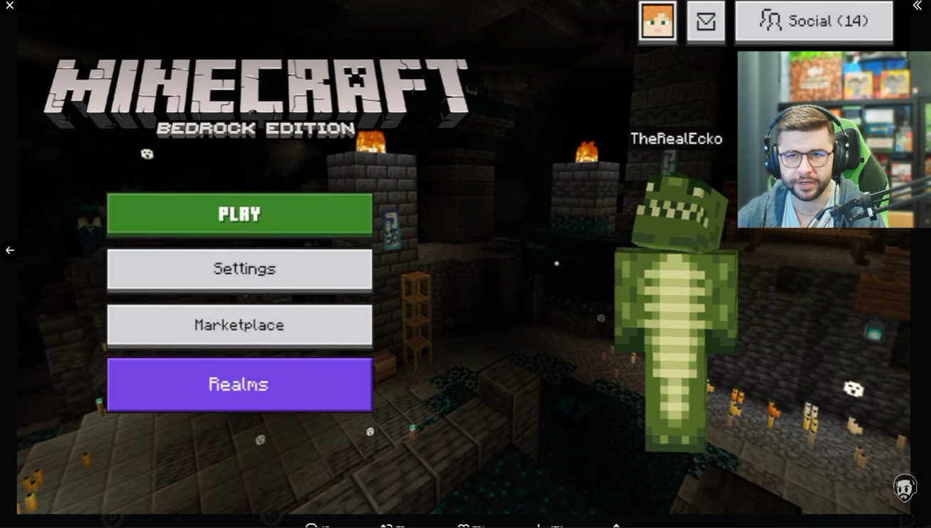
    I'm dissapointed that they want to make blocky casino from our favorite game. Sorry but this marketplace forcing is getting out of the hand. Settings should be ALWAYS below play button because of players' muscle memory. No matter which game is it. I dont think there's need to have marketplace button and entire new menu for it after scrolling in the main menu

    In my opinion, the main menu should look something like what Eckosoldier showed us (picture) with these changes:

    • Version number is missing - it should be there
    • "Bedrock Edition" title isn't necessary
    • Skin can be smaller - or not there at all
    • Main buttons should be centered - it looks better
    • Alex face in the top right corner should be face of player's skin
     

  • 3
    Registered User commented
    Comment actions Permalink

    Please change UI menu. I really don't like how the marketplace is being shoved down my throat. I hope you know this is really annoying.

  • 2
    Registered User commented
    Comment actions Permalink

    In my opinion, it looks a bit terrible because the buttons were moved to the left side, it's not convenient.I don't want to offend you, but maybe it needed to change the textures and have less marketplace advertising. I think the settings button should be put back in place and if you like this icon so much, then make it together with the settings.

  • 2
    Registered User commented
    Comment actions Permalink

    Regarding the new menu:
    . The settings button is quite a bit harder to find now, and harder to intuit when you do see it.
    . The version number needs to be visible, as my friends and I frequently need to check that were updated to the same versions.
    . The animated Marketplace buttons already cause significant lag on my iOS 18+ iPhone where I normally play. I think the increased ads will make Minecraft hard or even impossible to play from the menu for many children who play from older tablets and other handheld devices.
    . The aggressiveness and pervasiveness of the ads are also discouraging and they damage a lot of goodwill the players have felt toward the game up to this point. The UI brings to mind other games that have fallen into advertising decay, in a negative way.

  • 0
    Registered User commented
    Comment actions Permalink

    Forcing adverts and links to the marketplace won't entice us minecrafters to cultivate interest in the same.

    It just ruins the base game's experience. It would be good if the ui sticks to being purposeful rather than act as a redirection page for ads and marketplace content.

  • 2
    Registered User commented
    Comment actions Permalink

    This is so ugly now Minecraft are you listening to us

  • 2
    Registered User commented
    Comment actions Permalink

    I hope Mojang finally listens to our complaints and reverses this, because it ruins any good content they might add in game updates. People with low-end devices will no longer be able to play, all because of the Marketplace—which is forced to load. This is truly embarrassing, and I hope it never makes it into a final version of Minecraft. I paid to play the game, not to be subjected to intrusive ads, even on the main menu. The menu from a few years ago was far superior to this one 

  • 2
    Registered User commented
    Comment actions Permalink

    It's ugly and the current one looks batter and everyone's used to it

  • 3
    Registered User commented
    Comment actions Permalink

    Assuming we want to keep the marketplace hook at the bottom of the screen, I'd work it out so that the presentation doesn't appear as too-in-the-face. The idea here is to slowly guide player's attention to the marketplace section with ease, almost seamlessly:

    - Instead of marketplace icons that are peeking out at the bottom of main menu screen, I'd display 4 most recently played worlds thumbnails (also peeking/cut off). This includes: personal worlds, realms, and servers. They are arranged chronologically regardless of the play type of worlds.
    - A subtitle or heading reading "Recently Played" is placed above these thumbnails.
    - Next to the "Recently Played" subtitle is a downwards V arrow. Communicating that, just below the main menu screen, there's still more to discover.
    - The recently played worlds can only be selected when the bottom window has been expanded or the player has scrolled further down.
    - The 4 recently played worlds assumes the most top row. Below it, are rows for marketplace content, and then further below are rows for realms promotion.

    Additionally, the 3 main buttons in the title screen, from top to bottom are arranged as:
    - Play (button is colored green)
    - Realms (button is colored purple)
    - Marketplace (button has custom animation highlight)

    The dressing room button is moved to the right side of Skin preview. On top of the dressing room button is displayed the username for the player.

  • 3
    Registered User commented
    Comment actions Permalink

    New menu looks horrible, the logo isn't shown which makes it feel incomplete and slapped together, buttons are incredibly tiny, and the Marketplace ads are ridiculous. I have no problem with the Marketplace or the people who make stuff on there, but this is ridiculous and not at all what people actually want. People don't boot up Minecraft to go immediately buy stuff on the Marketplace, we boot up Minecraft to play Minecraft, the Marketplace is completely extra.

    Please fix the actual problems people have with Bedrock Edition instead of piling 20 more problems on top of it, you are actively making the most accessible version of Minecraft worse and creating much more hostility from the playerbase to the developers than needed with these completely incompetent and unneeded choices. This menu change is pointless and ugly, actively makes menu navigation worse, and ignores the actual genuine problems people have with Bedrock Edition.

    When people are telling you guys to fix Bedrock, please actually LISTEN to what they're asking from you.

  • 4
    Registered User commented
    Comment actions Permalink

    the new ui is pure garbage and it just shows minecraft bedrock has a very sad and dark future

  • 5
    Registered User commented
    Comment actions Permalink

    This UI is awful; it doesn't even feel like Minecraft. It reminds me of some game I downloaded as a kid that was packed with ads, please change it and add Arabic language.

  • 3
    Registered User commented
    Comment actions Permalink

    Cada vez que veo esta nueva interfaz me dan más ganas de jugar versiones antiguas y odio más el Marketplace la verdad, esto es el colmo a este punto mejor digan que quieren exprimirnos como limones, yo sinceramente no voy a actualizar el juego porque no tolero la existencia de esta interfaz, esto es tan malo que hasta me arruinó la semana entera, como siempre mojang arruinando el juego más y aún así mienten diciendo que escuchan a la comunidad por que si de verdad lo hicieran esto no hubiera durado ni una semana, estoy seguro que ni siquiera verán esto

  • 0
    Registered User commented
    Comment actions Permalink

    "How easy is it to get to where you want from the updated main menu?"

    If I need to actively hunt for the Settings button, meanwhile the Marketplace and Dressing Room buttons are big and clearly labeled, there is a problem there.
    Settings should be where it always has been, directly below the Play button. You guys got the same feedback when you moved the Settings button in the Pause Menu, so why are you making the exact same mistake again?
    I'm disappointed, Mojang. Do better.

  • 3
    Registered User commented
    Comment actions Permalink

    Don't do a marketplace centric menu it's not a good idea we don't want it at all keep the old starting menu and forget you ever came up with this .

  • 0
    Registered User commented
    Comment actions Permalink

    Change it back, it looks so bad, empty and boring, litterally nobody asked for this 😭

  • 4
    Registered User commented
    Comment actions Permalink

    please return the old menu or keep the 1.26.60 one its good and no one needs EXTRA MARKETPLACE BUTTONS